In the race between Trump and Biden, who wins for most user-friendly mobile campaign donation site?

Biden and Trump Presidential Election

The presidential election is less than a month away and as the candidates make their final pitches to the American people, they both need two things — votes and, of course, money, money, money.

Both candidates’ campaign websites are out in the wild ready to inform, persuade, solicit your donations and, yup…sell ya some swag. U! S! A!

While we recognize most people’s minds are already made up, blue or red, we couldn’t help but wonder just how influential these websites might be to someone who is on the fence and considering making a donation. We challenged our team to put our biases aside, for just a second, and take an objective look at each site’s effectiveness (side note, this proved to be a really difficult task).

We asked the question, what if, say, you were knocked on the head with a large pumpkin while decorating your house for Halloween. You woke to selective political amnesia and a sudden realization you had to donate $10,000 to either Joe Biden or Donald Trump or be forced to eat only candy corn for the rest of the year. Armed with only a smartphone, 10 minutes, and a link to each of their websites, who would get your money?

The winner, by a thin blonde hair, is the sitting president, Donald Trump.

But just like the debate fly on Mike Pence’s head, it was very close.

So, how did we get these results?

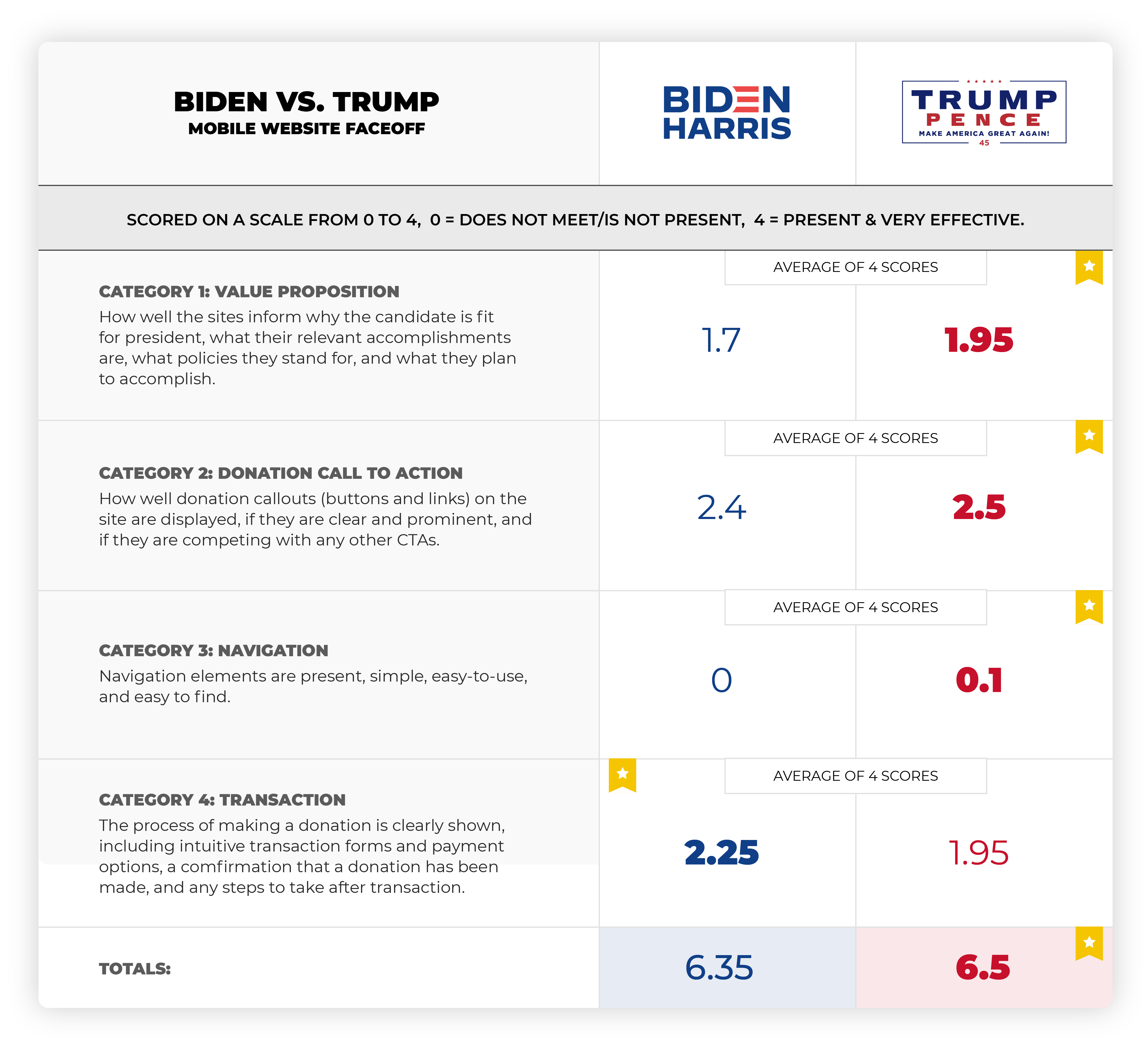
Five of our top UX design and digital experience experts evaluated each website’s mobile experience based on four experience categories: value proposition, donation call to action, navigation, and transaction. We broke these down into performance criteria and for each one we gave it a value from zero for “does not meet or is not present” to three for “is present and very effective.”

Five experts ran independent audits to score each site in these categories. To broaden our sample set, we then totaled and averaged our scores.

Want to see the whole heuristic audit? Scroll to the bottom for the full details.

Here are some result highlights: 

First, the bad news for both candidates — navigating through their sites on a mobile device is not easy. Both sites lack a clear value proposition, have too many competing calls to action, and navigation options and search is difficult if not impossible to find. So, while Trump is technically the winner here, both mobile websites have room for significant improvement.

For both sites, it appears that mobile design is not a priority. In 2020, that’s a huge oversight. From our perspective, this is a huge lost opportunity to reach a broader and younger audience ready and willing to engage.

Trump pulled ahead in the value proposition category. His website more clearly laid out his accomplishments and policies, though it lagged behind Biden’s in future planning.

When it came to the call to action to donate, Biden actually out-maneuvered Trump. Biden’s donation amounts started smaller — $15 to Trump’s $35 — and, according to one evaluator, were almost too prominent throughout the mobile experience.

But Trump’s calls to action were more consistent and a little less overwhelming. Unless you actually donated, at which point, the evaluator said, the CTAs became “absolutely unbearable in their persistence.”  

As far as that transaction itself, after you donated that $10,000 and moved on to a blissful, candy corn free 2020, neither was great. On Trump’s site, you have to sift through 14 screens before you reach a “thanks for donating” page. 

Trump’s pop-up ads felt like fake news, and Biden’s site was buggy in places. Neither full experience was very presidential from our perspective.

To summarize: 

First of all, we proved it’s really hard to put down biases to conduct an audit like this. Particularly when evaluating value propositions. We tried to stay objective and quantify our results as much as possible. While this is a small (statistically insignificant sample set) we still believe it provides valuable insights both camps could use to improve their sites and increase donations. 

Trump’s website is a clear winner in the usability category. But, it was a close (and certain to be a controversial race). 

For a website show-down in 2020 when user experience, navigation, and access to information is key, especially on mobile, we were surprised that both candidates’ sites were needing a lot of optimization. It seems shortsighted that both were primarily built for desktop. 

At this point, it’s probably too late for the candidates’ sites to be optimized. But hopefully not for you! Interested in seeing you how your website holds up to this kind of scrutiny? Contact Roboboogie at hello@teamroboboogie.com.

Regardless of who you are campaigning for, please get out and vote!

Assessment Disclaimers:

For this assessment, we decided to focus on the mobile experience but briefly viewed the desktop experience for comparison. Our assumption is that more than 50% of traffic to these sites is on small mobile devices but this has not been verified.

Also, please don’t get all fired up for a debate with us, we only have a small sample set here and we’re not intending to take a political stance. Our goal is simply to bring some levity to the election and demonstrate how a heuristic evaluation can be a helpful tool in identifying optimization opportunities and evaluating competitor experiences. 

Here’s our process:

To scorecard each website, we first needed to develop our evaluation criteria and assign a performance scale and value to each based on the following metrics

0 = does not meet/is not present 
1 = is present but not effective 
2 = is present and effective
3 = is present and very effective

THE EVALUATION: 

Category 1. 

Value Proposition (must be present within 1 click of home page)

These websites are largely intended to be informational. An online bio and portfolio of each candidate and their campaign platform.

The website clearly and concisely stated position on the following criteria:

  • Why/how they are fit to be president
  • Relevant accomplishments
  • What policies they stand for
  • Why these policies are important
  • What they plan to accomplish

Category 2. 

Donation call to action

For CTA’s we are going to focus on donations. We can assume that in addition to the informational side we evaluated above that donation solicitation is a primary site performance metric. 

  • Donation prompts are present and clear 
  • Donate CTA (button(s) is present
  • Donate CTA (button(s) is prominent 
  • Other CTAs are not competing with donations

Category 3.

Mobile Navigation:

  • Primary navigation options are 5 or less
  • Secondary navigation is clear and accessible
  • Contextual navigation is provided on the home screen to support primary content areas
  • Search is available and appropriately located

Category 4.

Transaction:

  • Steps to donate are clearly stated
  • Transaction forms and payment options are present and clear 
  • Error notice and recovery options are present and clear 
  • Confirmation of donation transaction completion is present and clear 
  • Post donation actions are present and clear

Turning data insights into record-breaking holiday sales with Roboboogie and FullStory

On Wednesday, September 30, Roboboogie joined up with our partners from FullStory and a group of excited UX and eCommerce professionals to share insights on optimizing eCommerce shopping experiences ahead of the 2020 holiday season. Along with the insights, Chris Zannotti from the FullStory team demonstrated how their digital experience analytics tool makes it possible. Oh, and we also ate pizza!

Meet John Gentle and Chris Zannotti

John Gentle is Roboboogie’s Founder and Chief Experience Officer (CXO) and has spent most of his professional career in user experience design, digital strategy, and iterative, data-backed design. His relationship with data went next-level when Roboboogie partnered with FullStory two years ago, turbocharging Roboboogie’s work with notable eCommerce brands and leading them to the conversion rate promised land. For our event, John shifted his attention to a reflection on behavioral traits we have typically seen from holiday shoppers online, and how you can optimize your site to meet those shoppers with an optimal eCommerce experience.

Chris Zannotti is a seasoned sales engineer with FullStory who has mastered the ins-and-outs of understanding a business’s needs and demonstrating how FullStory can help them improve their digital experience. For our event, Chris focused his efforts on demonstrating how FullStory makes it easy for eCommerce, UX, and marketing teams to understand where in the conversion process users are experiencing frustration and identifying the contributing factors.

Evaluate and anticipate shoppers’ needs

The theme of this holiday season is: “Expect the unexpected.” 

Simply reviewing analytics from previous holiday seasons is not enough this year. There are too many external unknowns as a result of the pandemic that are influencing shopping behaviors, including; what people will buy, how they will shop, and how they are evaluating online shopping options. 

The best way to prepare for the unexpected is to find and fix potential problem areas that exist now, and anticipate how user behaviors will change on your site when shopping really ramps up.

The way we identify optimization opportunities is to bring data and design together.

Our analysts look for performance issues in the data, and then pass those to design to hypothesize potential cause from a design perspective. Simultaneously, design conducts user-centric heuristic evaluations and looks to the analyst to get data confirmation of the suspected problem area. 

In the past, these evaluations have been challenging, requiring teams to cobble together data and insights with focus groups, user tests, GA data and scroll maps. This is why we love FullStory – it plugs in quickly, instrumentation-free, and quickly gathers both qualitative and quantitative data, quickly surfacing issues and providing a forum for deeper discovery.

In regards to evaluating potential new needs, a helpful and easy exercise is to simply generate a list of questions customers might be looking to answer on your site. Then take that list and evaluate it against your current experience to see how effectively your site is answering those questions: 

What are shipping costs? Do they offer contactless store pick-up? Since this popular item is out of stock, is there a similar alternative that is available? If the world ends after the election, can I get my money back on all the items I purchased?

Identify and prioritize leaks

Weaknesses get amplified and expose underuse and stress. Things that are broken now or causing frustration for your users will be magnified under the increased traffic and shopping stress of the holiday season. And eCommerce managers often have an internal push vs. pull debate around where to start fixing UX issues (check-out vs. homepage).

We typically start in checkout since there is high intent for purchase being shown – recognizing that people might be evaluating final costs/doing cost comparisons. Resolving UX and technical blockers that are keeping them from completing their purchases has a direct impact on ROI for those customers, as well as new customers who may be driven to your checkout funnel.

While we recommend starting at the checkout funnel, we have also found instances where seriously blockers kept users from entering the checkout flow or finding the products they were looking for. Starting from the checkout funnel, you can work your way backward through individual products, to product categories, to your homepage, evaluating the UX opportunities through each step.

It’s unlikely that you’ll be able to optimize all phases of your site between now and the holiday season, so we recommend you quantify and triage. FullStory’s Conversions tool identifies drop-off points, user frustration metrics, and attributes revenue (!) to all stages of a conversion path. This allows you to quickly pinpoint areas where you are potentially losing the most money. That’s right, it shows you the potential lost revenue from every step of your funnel. As you might suspect, we recommend reviewing those areas first as you start prioritizing your fixes.

Optimize for behavioral differences

There are different types of shoppers and browsing habits for online shoppers, not unlike shoppers in a physical retail location. We recommend segmenting and observing the types of shoppers you have on your site and optimizing the ways they navigate through your site. We often observe users navigating in three ways: through your primary navigation, using your search functionality, or finding their products contextually.  

As you fix some leaks and start feeling good about the pending flood of shoppers and what they might need, it’s a good time to look a little deeper and consider the needs of your smaller audience segments based on traffic sources, device types, product affinities, brand loyalty, etc.

As a starting point for behavioral optimization, we recommend evaluating how effectively your site is supporting the three primary modes of moving around a website – search, navigation, and contextually (content). 

These modes can indicate user intent. For instance, many people who come to a website knowing what they want (make and model) enter from Google search or enter an onsite search. While it’s not a steadfast rule, this can help further segment and understand user behavior. It’s also important to recognize that many sessions will contain the use of two or three of these modes. 

One example is a shopper who may start with a list of very specific items they need to buy for friends, with known brands and models, but also has a list of people they need to buy for and knows what they like in general so they need to do some window shopping, but is not comfortable going to the local mall.

Assuming you have the items they know they need, how do you get them to not only purchase those items but also discover that you have awesome gifts for their friends?

In general, these are behaviors that would be difficult to understand and optimize for in Google Analytics. With a digital experience analytics tool like FullStory you are able to not only isolate user segments but also see exactly what they did and why it’s working or not working. You can watch real user session replays for any segmented group, as well as observe click maps, scroll maps, and heat maps, as well as frustration metrics, for each segment.

It’s not too late to start optimizing for this holiday season!

Here’s the good news. It’s not too late to start optimizing or continue optimizing for the 2020 holiday season. Our team firmly believes that nearly every eCommerce site can be continuously optimized to further improve user experience, increase conversion rate, and increase average order value. Deploying a new instrumentation-free DX analytics tool like FullStory can uncover opportunities large and small that could have a dramatic impact on your conversion rate and average order value. We’d love to chat with you about the potential for your site. Ready to get started?