When a website is designed and built to address a diverse range of individual’s needs, more users have equal access to information. Website accessibility empowers users with agency, arming them with a sense of meaningful purpose and responsibility throughout their customer journey often leading to improvements in general customer experience and loyalty.
According to a published report from November 2021 by the World Health Organization, over 1 billion people live with some form of disability. This is about 15% of the world’s population. Accessible design considerations target and address the very needs of those who are experiencing some form of disability. Let’s take a moment to consider the various ways an accessible website can help achieve your overall business goals and improve customer experience.
Website Accessibility is Crucial for Equal Access to Information
Accessible design and development creates easy to navigate, functional tools that every user can use. For customers with disabilities, accessible experience is essential for equal access. However, accessible development can be useful to all users experiencing various forms of disabilities or socioeconomic and situational limitations, for instance:
- Subtitles benefit more than users who are hearing impaired. They can be helpful for people who are in noisy or shared environments where sound cannot be heard, access to headphones are limited or when they are unable to use speakers or other personal sound systems.
- People whose abilities are varied and changing daily due to age or impairment.
- Those who are experiencing temporary disabilities due to an injury.
- People experiencing cognitive, learning and developmental difficulties.
- People experiencing situational circumstances. For example, a busy parent who needs to be able to navigate your website with only one hand, while carrying around a baby with the other.
Building An Accessible Website Is A Sound Business Decision
There are many competitive advantages to having an inclusive website. Building a more accessible website better positions you to serve users that your competitors cannot. You’ll have lower bounce rates by reducing the number of users who immediately leave your page because they rely on other assistive technology. Your page’s overall SEO improves since Google considers accessibility essential; it is a factor in ranking and indexing websites.
Because of the prevalence of internet usage and its significance in our daily lives, many countries are acknowledging user experience and accessibility. For many businesses building accessible websites is no longer just a moral act. It is now officially required through The Americans with Disabilities Act. The ADA mandates that businesses open to the public provide full and equal enjoyment of their goods, services, facilities, privileges, advantages, or accommodations to people with disabilities. Examples of businesses open to the public:
- Retail stores and other sales or retail establishments
- Banks
- Hotels, inns, and motels
- Hospitals and medical offices
- Food and drink establishments
- Auditoriums, theaters, and sports arenas
Tips for Building an Accessible Website
These are a few simple steps to get started building a more accessible website:
Semantic HTML–
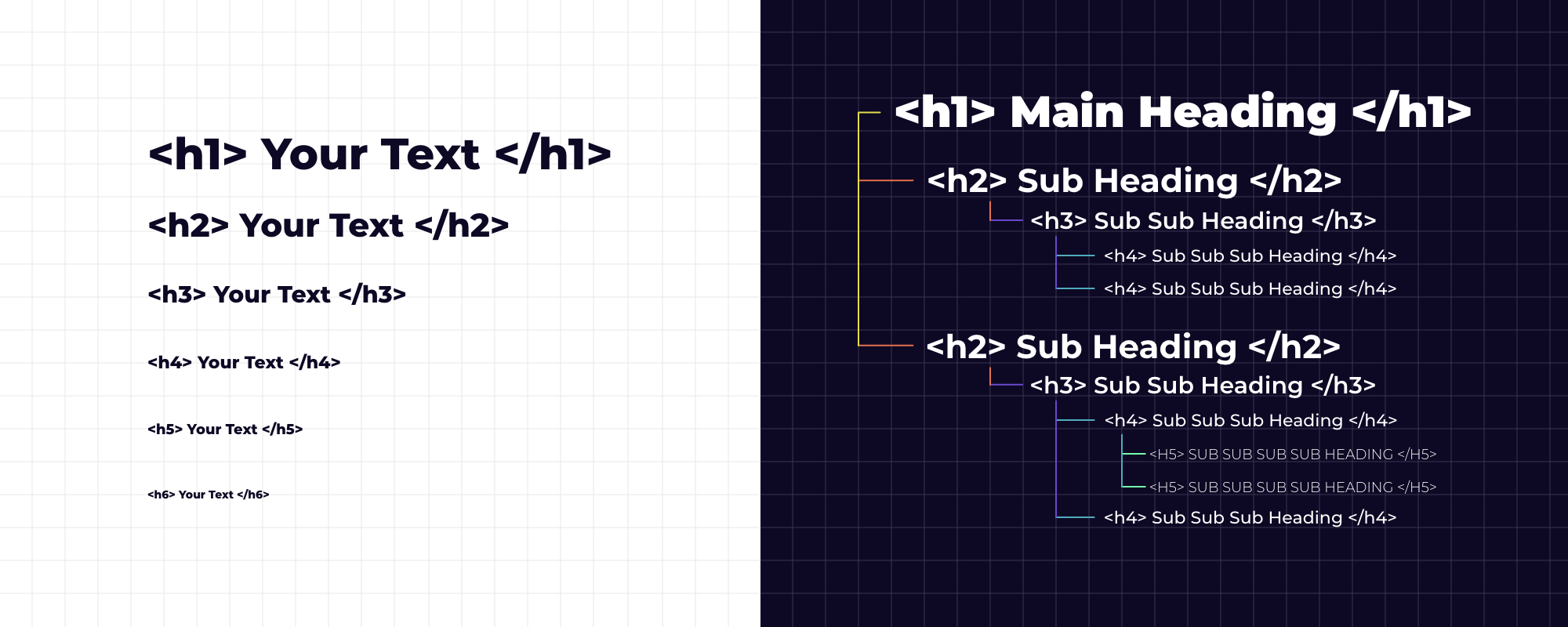
Semantic HTML is the foundation of any website, and using purposeful code is the foundation of an accessible website. Many accessibility tools, such as screen readers rely on Semantic HTML to help guide a user through a page. When done incorrectly, it can make it difficult, if not impossible, for a user to navigate your website. While many developers may not use all of the semantic elements available, opting for non-semantic elements like <div> or <span>, one semantic element all developers use are H tags.
Using H tags is similar to writing an outline for a paper as shown in the below image on the right. Rather than thinking of the H tags as size dependent as shown in the below image on the left, it is important to keep in mind that they also need to be used for content sorting.
Alternative Text
When an image exists on a page, alternative text helps users of screen readers to have the images described to them accurately. A screen reader is a type of assistive technology that translates what is being displayed on the screen to audio or braille. It’s important that you describe what is happening in the image, give context, and don’t give a one-word description like “person.” Instead, opt for something like “woman riding through the countryside on a bike.”
Give Buttons and Link Accessible Names or Descriptive Labels
A simple “learn more” button can leave some users of adaptive tech asking, “What am I learning more about?” In an ideal world, all buttons would use descriptive text that details what clicking that specific button would do, but that is not always the case. If you are unable to change the button text for various design reasons, for instance the button size, or it is an icon, you can write a brief description of what the button does and add it to the button using an aria-label; now users of screen readers know exactly what the button does.
Supporting Keyboard Navigation is Crucial For Accessibility
The keyboard is vital to people with disabilities. People with motor disabilities and those experiencing visual impairment rely on screen readers, people who do not possess precise muscle control, and even power users, are dependent on a keyboard to navigate content. Ensuring that a webpage can be accessed solely using the keyboard and that clickable items have “Focus” states, so users understand what they are selecting is an important part of making a website accessible.
Form Labels and Instructions Are Key For Website Accessibility
Website forms can often possess disadvantages that prevent screen reader users from understanding them. Using “Placeholder Text” as labels is one of the biggest mistakes when designing a form. While the simplistic design can be appealing because it saves space and looks better in the design context, “Placeholder Text” is unforgiving to those who are unable to see your design. People who rely on screen readers typically navigate through a form using the Tab key to jump through the form controls. The elements are read for each form control. Any non-label text, such as “Placeholder Text”, is skipped over. This prevents the user from completing the form, and we wouldn’t want anyone missing out on signing up for something extraordinary on your site!
When tasked with building a form that solely uses “Placeholder Text”, our developers will add form labels while using CSS to conceal them. The form retains the integrity and vision of the client while keeping the form accessible to all.
When you design and develop websites with inclusivity and accessibility in mind, you create a space where every user can thrive and have an experience that is both empowering and limitless.
It takes a dedicated team to create a fully accessible user experience. This requires additional development work, knowledge and experience. Let us help you ensure that your website is accessible and inclusive for a broader audience.