May’s Camp Optimization came upon us and we found ourselves at Show Bar, right down the hall from the Roboboogie head office in SE Portland. This month, we were graced by a few new friends from FullStory, including Sr. Director of Product Management Agata Bugaj, who came to talk about the future of AI in online interactions through her topic, “The Path to CX Omniscience—the Power (and Potential Pitfalls) in Predicting User Frustrations.”
At FullStory, Agata spends a lot of time working on customer interaction. She opened her talk with a story about looking for a gift for her son on a well known big-box brand’s website and finding herself frustrated as she couldn’t find what she was looking for. She realized that in a store, she would be able to find an employee to come to her aid. However, her online frustration couldn’t be resolved so easily. But if it could, would it be… creepy?
Through technology like what FullStory offers, Agata explained how her woes could be identified, addressed, and resolved.
The Problem
How do you know when users are frustrated? There are only a few paths customers can take online to report issues. (Think of it as the digital version of “I’d like to speak to the manager.”)
The pathways include:
Support tickets: A support ticket can come in several forms, either through email, “contact us” page, or a direct pipeline. But, as Bugaj explained, we’ve already put the customer through enough pain, why put the burden on them to express their frustration? This isn’t an efficient way to connect.
Social media: This one elicited some chuckles from the crowd. Think about the times you’ve put a brand on blast for a bad experience. As Agata said, “when our customers are frustrated, we want to know, but we shouldn’t find out at the same time as the rest of the world.” Users know this is effective, although not the quickest or most fun.
Analytics: This is a great tool but it comes with downsides. Pointing out the tendency for false-positives and difficulty isolating an event, analytics can be difficult to identify specific pain points.
Frustration Signals
Online, user interaction is interpreted differently than in-person interactions. There are a number of signals that can be identified and learned from—this is something that the FullStory tool has been focused around and utilizes AI to learn from. FullStory has spent years developing and learning from these frustration signals in order to improve their tools and respond faster to customer issues. Frustration signals fall into these categories:
Rage Clicks: We’ve all done it. We’re in the shopping cart, fill out all our information, and go to click the purchase button to find that nothing happens. You hit it again and again. Finally you’re slamming on your mouse like your life depends on it and still nothing happens before you finally quit.
Dead Clicks: Dead clicks indicate users are using your site in a way that wasn’t intended. Clicking on an image or text with no links indicates that your customer is intending to use your site in a certain way, but it’s not working and they’re getting frustrated.
Error Clicks: Often associated with broken links or errors in site functionality.
For example…
When FullStory launched a new UI, they noticed a spike in rage clicks. By watching these interactions, they could see that customers were looking for more information that wasn’t there—clicking on keywords that didn’t have links to any more content. FullStory learned in real time that their website needed to add more detailed information, and they were able to act immediately and witness an almost immediate drop in rage clicks.
Interpreting Frustration Signals
Context is everything. The advantage of tracking user behavior is identifying trends, but seeing is believing. Watching user experiences can help verify frustration, and FullStory’s capability to view user session replays helps prevent things like the dreaded false positive.
Another important step is quantifying the impact. How big is the issue? Is it worth paying attention to? Taking these items into consideration will help prioritize any problems as they arise. Another tactic is to set up alerts. Say you have a small frustration on your website where customers occasionally get stuck, but it’s only 2-3% of your audience. By setting up an alert, it can help identify if a small frustration becomes a bigger one, say closer to 10%, which can help you head off potential issues.
With machine learning, these issues will become fewer and fewer, as the technologies will be able to get out ahead of potential pain points and solve problems proactively.
Avoiding Pitfalls
Identifying and avoiding pitfalls is key to ensuring program success. Here are a few to look out for:
Only looking at one facet: Narrowing in too far can lead to a biased interpretation. By looking at the context surrounding an issue, you can better understand a customer’s frustration and make more informed decisions on optimizing your website.
Alerting on the wrong signals: Being intentional about what you pay attention to is important as well—do you care about when 1,000 customers hit this frustration, or 10% of traffic? Be sure to keep an eye on your numbers and KPIs.
Being creepy instead of helpful: Perhaps most importantly, avoid being creepy instead of being helpful. As AI becomes more efficient, people will likely get used to it as it only becomes handier and more helpful. During the rollout of Facebook’s newsfeed, for example, people found it creepy and stalker-ish. Now it’s a part of everyday life. You should ask “is this the best way to achieve my goals?” If you’re not careful, you can scare away even the most dedicated of your customers.
Big Thanks to FullStory
Thanks Agata and the FullStory team for joining us this month, and to everyone who came out to May’s Camp Optimization. Mark your calendars for the next event on Thursday, July 25, for a Digital Experimentation Strategy Hack with the Technology Association of Oregon. Drinks are on us!
The old adage is true, a picture can be worth 1000 words. However, use the wrong image, and you might communicate the wrong 1000-word message. But in a highly dynamic and fast-paced world, communicating your message quickly is key to reaching customers.
Remember to keep things visual, while communicating the right message:
Images effectively and efficiently tell a story – carefully select images that support your message to tell the story you are trying to communicate at a glance.
Visuals set the right mood – Imagery, textures, and patterns can be used to set a tone or mood. This not only helps make your brand more relatable, but it can also significantly influence purchasing decisions by increasing customer confidence and comfort level.
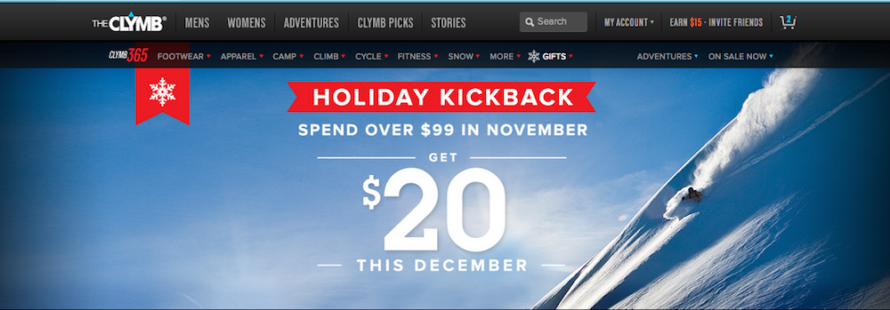
True story: Put snowflakes on everything.
Through testing and optimizing the web experience for The Clymb over several holiday seasons, we discovered the power of thematic content changes: including the addition of winter/snow themed visuals, which increased shopper engagement and buying propensity by as much as 30%! Since the discovery, the concept has proven effective across numerous industries, user types, and digital experiences. Remember: put a snowflake on it!
Images and illustrations effectively communicate more complicated concepts – a series of images or infographics are an effective way to communicate more complicated concepts, processes, or products/services.
Users love videos – Recent user studies show that over 70% of users would prefer to watch a video than reading text to learn about a product. However, videos need to be well-written and well-produced. Be mindful of length – videos should be concise and informative.
Another true story:
Visuals make connections. Visual content developed for Mindful Meetings helped contribute to a whopping 22% subscriber rate and a 25% lift in online sales throughout the campaign.
Tell a story
Telling a story that provides tremendous value to readers helps them see the value your brand can provide for them. Powerful visual assets and good design show you care enough to create an experience that works well and is enjoyable to navigate and use. Good content makes people happy, and happy customers convert*.
*Full disclosure: Roboboogie is a design-forward agency, so we are completely and utterly biased in our belief that investing in good design is money well spent. Fortunately, you don’t have to take our word for it. We’ve got plenty of data that proves it.
And that wraps up our series: Have Great Content. We hope we have shed some light on the power content can have in driving engagement and conversions as part of your optimization process and that “having great content” is on its way to becoming one of the key pillars in your efforts of driving user engagement, satisfaction, and conversions.
Want to talk about your content marketing and optimization strategy? We’re always down to talk. Hit us up.
Today’s digital landscape is crowded with voices. Consumers are intelligent and can distinguish between inauthentic and genuine messaging. Therefore, the necessity of ensuring messaging is authentic has become increasingly important.
Let’s talk brand values
Successful brands are deeply rooted in a set of values and beliefs. With the number of choices continually on the rise in this digital age, success lies heavily in creating an emotional connection with customers. Consumers want to support brands they can trust, and trust comes from authenticity.
Be original but authentic
In addition to being contextually relevant (check out Part 1 of this series), a great way to ensure you are effectively engaging your audience is to provide original content. Show your users something unique that evokes a positive emotion, and they will be far more likely to engage with your content.
But don’t push things too far at the expense of being authentic. Know your brand and where you stand, and be true to that. Audiences see right through inauthentic experiences and will respond negatively to content that is not in alignment with your brand.
Here are a few simple tips for making sure you are presenting original content:
Avoid commonly used/low-quality stock photography – image quality, composition and subject matter are all critical to providing effective imagery. These days, there are plenty of stock image sites out there providing affordable, high quality, original options.
Invest in custom illustration – Custom illustrations require an investment in good design, but they are an effective way to create a unique content experience, and often a more sophisticated look-and-feel that can elevate your brand.
Include some small moments of delight – Adding subtle creative design elements, animations or copy that is discoverable or unexpected is a great way to create memorable moments.
Work with skilled writers – Every brand should have a unique and consistently used tone and writing style. This is a really cost-effective way to be original and set your brand apart.
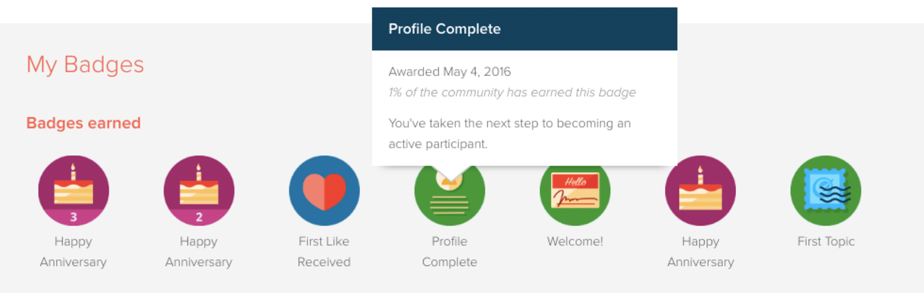
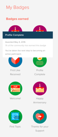
OPTIMIZELY GAMIFICATION
Optimizely came to us with a desire to boost community sign-up and engagement. We helped Optimizely execute a gamification and “badging” experience. Introducing gamification and badges increased content engagement by 50%.
Being authentic doesn’t always fall in line with the status quo
One of the most significant trends to emerge from 2017 was the tremendous value of brands expressing their beliefs in their marketing messages. Don’t be afraid to challenge concepts; readers appreciate and respect honesty in brands. An authentic brand doesn’t always go with the norm, but will always be applauded for paving its own distinct path in the marketplace.
A personal brand voice gives a human touch to brands
Brands that express marketing messages with an authentic voice are steering the future of brand content. Customers want to create emotional connections with brands and brands want to drive customer loyalty. Therefore, to create “great content,” brand marketers should write their own personal experiences in tune with the values of their brand to help forge a meaningful connection with customers.
Catch the third and final part in our Have Great Content series, Part 3: Develop Visual Storytelling, here.
It has been over 20 years since Bill Gates infamously proclaimed ‘Content is King.’ With new technology, interfaces, user needs and trends, the proclamation still rings true as ever. No matter how innovative or engaging an interface is, without meaningful, compelling content any user experience falls short.
At roboboogie, we take content seriously as part of our optimization process. We believe that having great content is one of the key pillars to driving user engagement, satisfaction and ultimately conversion.
Over the coming weeks, we will work through a three part series called Have Great Content, where we will unpack our approach to developing a strong content strategy.
So let’s get started. Step one? Know your audience. Great content is all about matching copy, imagery and other media to needs of your specific user base by drawing in the right crowd and delivering value at the right time and place. Read on to explore these concepts in more detail below.
Context is critical
It’s true, the average human’s attention span is 1-3 seconds shorter than a goldfish’s. That leaves you with only 6-8 short seconds to capture your audience’s interest and get them to engage and interact with your website.
So, before you create any content, take time to understand exactly who your target audience is, where they are coming from, and what exactly it is they desire. Do your research and you will quickly see it’s time well spent. Simply asking 8-10 target customers what they want and expect from your website will inform your content strategy and ensure your site stays relevant.
Here are some compelling reasons to keep content contextually relevant. When content is relevant to your users it:
Immediately captures people’s attention, typically decreasing bounce rate.
Provides your audience with what they want and need to increase engagement and session duration.
Aligns with actions your target customers are already considering to improve, resulting in improved conversion rates.
TIP
Integrate interaction and paths to conversion into your content to streamline the user experience. This example showcases the integration of shoppable products within blog imagery for Bamboo. The result? A 20% lift in product purchase click-through.
Attract the right crowd
Having the right content on your site is not only critical to your customers finding and getting the information they seek to successfully convert, it’s also critical to ensuring your target audience finds your website through organic search.
Effective SEO deploys a number of content strategies to ensure visibility and reach. While our intent here is not to go too deep into those specific strategies, there are some high-level things to consider when looking to effectively attract and retain any specific audience group.
Know your audience – We use several audience profiling techniques including user profiles and journey maps to document user needs and desires. Focus groups and surveys are also extremely valuable.
Speak their language – Make sure you speak to your audience’s level of understanding. Also, keep in mind there will be some variability based upon where users are in their journey. It is important to address each phase intentionally.
Establish clear segmentation strategies and navigation paths – It’s not only important to speak your users’ language, but also to provide a clear path relevant to getting to that content.
Be prolific but stay focused – Blogs are great ways to provide your audience with authentic and less sales-y content that may reach a broader audience. Once primary content is optimized, it is important to broaden your reach and build awareness with new audience members. A cadence for regular content publishing is important as well. It’s good to put a lot of content out, but it is important to verify it make sure it at least ties back to some common industry or marketing theme, and is in alignment with your brand/industry/product offerings.
Make sure you are setup to convert – It’s great when your content efforts attract the right people to your website. But it is crucial to take the steps to ensure it’s even better when they convert. Implement ongoing testing to be sure you are constantly testing your home content approach and offers, and for conversion paths to meet and exceed your goals.
TIP
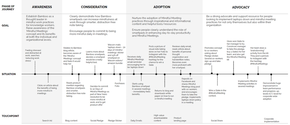
Start by laying a framework for your ideal customer journey. Exploring customer data (both qualitative and quantitative) and market trends, and overlaying with the ideal target customer can help bring the customer journey to life. In this example, we worked closely with Bamboo to help them understand their audience, and map the ideal journey to inform optimization strategy (including content).
We hope you’ve enjoyed the first part of our Have Great Content series. Continue reading along with the second part in the series here.
Data visualization is traditionally described as the use of visual representations of data to expand human cognition. Data visualization, sometimes called information visualization, was born out of the field of Human Computer Interaction and helps humans make sense of data through visualization techniques like color, size, and other data representations. There are 2.5 quintillion bytes of data produced each day and our brain can only digest so much. This is why we show the data in easily understandable ways, such as graphs and charts, so that us humans can better understand its value.
How to Use it in Business
All types of businesses, large and small, are using data visualization to help better understand their data. Data visualization can be used to comprehend information quickly, identify relationships and patterns in data, pinpoint emerging trends, and communicate the story of data to others. Tyler Hudson, Behavioral Analyst here at Roboboogie, uses data visualization “To articulate complex data points in a meaningful way.” Tyler says creating visualizations is “the easiest way to convey a lot of data in a short and meaningful amount of time to clients.”
About Tableau
Tableau was created in 2003 by three people with a vision for making databases and spreadsheets understandable to ordinary people. Its creators come from diverse backgrounds of an Academy Award winning professor, a computer scientist at Stanford, and a business leader. Tableau Software now produces many interactive data visualization products including Tableau Public, which we will use in this tutorial. Tableau has consistently been named an industry leader in Analytics and BI by Gartner, and has been featured in Forbes, Fortune, and on CNBC. Tableau is used by people around the world and is an industry leader in data visualization.
Tableau works great for simple to complex visualizations. You can easily create bar charts, line graphs, bubble maps, box and whisker plots, and even detailed maps. With unlimited “undos” and a great online resources for help and inspiration, the possibilities are endless. We know it can be daunting to get started, but we’re here to help with first steps getting familiar with the tool.
Tableau Tutorial
In this tutorial, we will be walking you through how to set up Tableau and create two visualizations. This instructional should give you the tools to explore Tableau more on your own and be able to create interesting visualizations for your work or personal life.
Is Your Computer Ready to Download Tableau?
First, you’ll need to make sure that your laptop is ready to install Tableau. Confirm that or update your computer such that:
It is running Windows 7 or later, or OS X 10.10 or later.
It has at least 1GB of free memory (2 GB is even better!).
Downloading Tableau Desktop or Tableau Desktop Public Edition
If you don’t already have Tableau, you must first download Tableau Desktop. If you are a university student or part of another organization which may give you access to Tableau Desktop, check to see if you can get a license key to access the full version. Otherwise, the Tableau Desktop Public Edition has just as many features for simpler projects and will work just fine for most visualizations. We will be using the Tableau Desktop Public Edition for this demonstration.
To download Tableau Desktop Public Edition, go to https://public.tableau.com/s/ and enter your email in the “Download the App” field. Tableau will then start to download an installer to your computer, open this download and follow the instructions given.
Make a Tableau Public Account
Next, you must make a Tableau Public Account. Publishing visualizations is done through Tableau Public, a web service that is integrated with the Tableau Desktop software you downloaded onto your computer.
Before you can upload a visualization to the Tableau Public server, you need to create a profile for Tableau Public:
Underneath “Don’t have a profile yet?” click “Create one now for free”.
Fill out the information accordingly.
Check your email to confirm and activate your profile.
Now we’re ready to practice creating visualizations in Tableau Desktop and publishing to Tableau Public!
Download the First Dataset
Our first visualization deals with the Street Trees dataset. This is a dataset of all of the street trees mapped an identified by Portland Parks & Recreation Urban Forestry division. To download the first dataset:
This will download a CSV to your computer called “Street_Trees.csv”. “CSV” stands for “Comma Separated Values” which is a simple file format to store tabular data. If you want to see what a CSV file looks like, you can open the file in any text editor.
Import the Data
Great, now we are ready to import the data into Tableau! Go ahead and find the Tableau Desktop or Tableau Public application on your computer, the icon should look like this:
On the left in blue, choose Connect (or Connect to Data) → To a File → Text file. After clicking Text file, a pop-up screen will appear.
Navigate to the file you just downloaded, “Street_Trees.csv”.
Select it and click Open. Tableau should refresh to the Data Source tab.
Explore the Data
It’s good practice when working with a new data set to skim it to get a feel for the kind of data it contains, see how it is set up, and find any possible errors that may have occurred in exporting it.
Notice the Data Source tab on the bottom left. You should see the name of the data source that Tableau is looking at (or connected to). In this case, it should be connected to Street_Trees.csv.
Scroll through the spreadsheet from top to bottom to review the rows of data.
Scroll left to right to see all of the columns in the dataset.
Now, let’s investigate the columns a little further.
Observe that the name of each data column is bolded.
What do you think each name means?
Also notice the symbols at the top of each column (e.g., #, Abc, etc.).
These symbols show how Tableau has guessed the kind of data (AKA, the data type) that is associated with each data column. Do they look correct?
Take a moment to skim the rest of the data columns. What kind of data does each contain?
Click on one of the data type labels to open a dropdown menu, which lets you see the other types of data Tableau columns can hold and allows you to change the data type as well.
Make an Edible Tree Visualization
We are going to make two visualizations using this dataset, one timeline and one map. To make a visualization, we’ll need to leave the Data Source tab and go to a “Sheet.” At the bottom left of the Tableau window is a tabular menu to move between various tabs. From this menu, click on Sheet 1.
Renaming the visualization
Now let’s change the name of the sheet, since it’s not very descriptive!
Double-click where it says Sheet 1 on the tab, which should highlight the text.
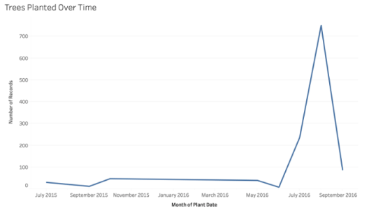
Rename the tab to Trees Planted Over Time.
Notice that when you changed the name of the sheet, the title of the visualization changed too.
Double-click the title itself to see how you can also edit the title this way.
If you edited the title here, it would allow you to have a different title than what is on the tab name.
Dimensions & Measures
All of the data fields (i.e., the column names from the Data Source spreadsheet) are listed on the left side of this window in the Data tab menu. As we learned before, Tableau guesses the kind of data that is in each column of your dataset – you can see the labels for these data types here too.
Look specifically at the types of data listed under Dimensions vs. the types of data listed under Measures and notice:
Categorical/qualitative data are listed under Dimensions.
Numerical/quantitative data are listed under Measures.
A Dimension that is dragged over to Columns shows a blue background color.
A blue background means Tableau has has determined the data is discrete (i.e. it takes particular values).
A green background would mean Tableau has determined the data is continuous (i.e. it can take on any value within a finite or infinite interval).
Dimensions can only be continuous when the kind of data contained in the column is Date data.
Tableau creates a continuous axis when a field from the Measures area is dragged into Columns or Rows.
In the future, you may need to change these initial assignments (i.e., Dimensions vs. Measures).
To do so, you click on the arrow next to the data name to open a dropdown menu.
Then you select “Convert to Measure” or “Convert to Dimension.”
Making a Timeline
On the left side under Dimensions, you should see a field named “Plant Date”. This field contains the date and time the tree was planted on. Right now it says the data type is text, when it should be treated continuously as a date and time. We can change this by:
Clicking the dropdown arrow
Going to “Change Data Type” then clicking on “Date & Time”.
You will see the “Abc” icon to the left of the field turn into a calendar icon.
Now, drag Plant Date to the “Columns” field on the top of the window. Tableau should now show a table with 3 columns for Null, 2015, and 2016. Now, under Measures, drag “Number of Records” to the “rows” field. Tableau should now show you a line graph. Now we have to try and show the data in a more meaningful way:
There seems to be many nulls in Plant Date.
Click on the “Null” label at the bottom of the visualization.
In the popup that appears, click “Exclude”. This will exclude any null values from our data.
Just seeing the two years for our data is not very helpful.
Click on the dropdown for Plant Date in Columns.
You will see that, right now, Plant Date has a “YEAR” next to it.
In the dropdown, select “Month”.
You will see two options for Month, you want to select the second one because it will change the field to a Dimension rather than a Measure. We want to see the trees planted over a time period which is a continuous variable. See below.
Now, your visualization should look like this:
We can determine that most trees were planted in August of 2016 just by hovering over the maximum point on your line graph. You should also be able to determine that the number of trees planted increased over time.
Making a Map
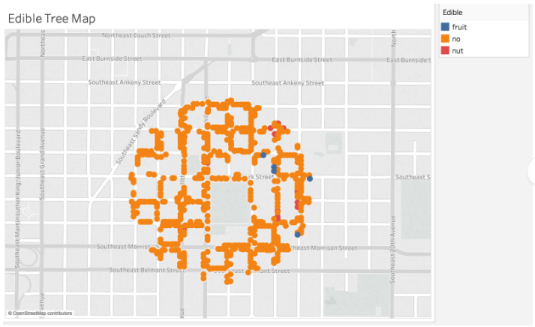
Great! Now let’s move onto one of Tableau’s most powerful visualizations: the map. First, we will need to create a new sheet. Hover over the tabular menu on the bottom of your screen and click the icon that says “New Worksheet”. This will open a blank sheet for you, let’s rename it to “Edible Tree Map”.
If you remember from looking at the data, there seemed to be two fields that resemble a latitude and longitude labeled Y and X, retrospectively. Sometimes, Tableau can automatically generate Latitude and Longitude fields from address or country fields but it did not in this case. Therefore, we will have to tell Tableau these data types:
Click on the dropdown on the X field.
Go to “Geographic Role”.
Select Longitude.
Click on the dropdown on the Y field.
Go to “Geographic Role”.
Select Latitude.
Now, drag X to Columns and Y to Rows.
You should now see a map with a single point in the Portland, OR area. This is because Tableau is automatically taking the average of the latitudes and longitudes and placing them in one data point. We want to see the latitude and longitude of each tree as their own data point, so we must add “detail”. To do this:
Find “Object ID” under measures. This is an ID given to each tree recorded, which has a latitude and longitude associated with each one. However, since the ID is a number, Tableau is reading it as a measure.
Convert Object ID to a dimension.
Drag Object ID to “detail” under the Marks panel on the left side of the map.
There are a lot of data points in this field. You may get a pop up from Tableau asking if you want to include all of them. Say yes for now and we will filter some out in the next few steps. Now, zoom into the map to find the area you want to focus on. For this tutorial, we will be zooming into Revolution Hall (Roboboogie’s home!).
If you are having trouble finding a location without street names, you can edit the map layers.
Click on Map in the top menu.
Select Map Layers…
In the menu that opens on the Left side of your screen, check the box that says “Streets and Highways”.
Exit the Map Layers menu. We want to select an area of the map that has a radius of about 500ft.
To do this, hover over your map and a small menu with icons will appear.
Hover over the arrow in the last option to open map selection options.
Choose the radial selection option. (See below)
Select an area of about 1000ft by clicking and dragging to create a circle.
Once you create the circle, you will see a menu pop up like below.
Click “Keep Only” and this will exclude all data points except for the ones you have selected.
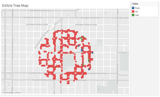
Great! Now let’s add some meaning to the dots on your screen. You will see that there is a data field for Edible under Dimensions. This field will tell you whether the tree is a fruit tree, a nut tree, or not edible. Let’s drag this field to Color under the Marks panel. You will see that Tableau changed the colors of the dots to correspond with the new menu on the right.
However, “no” and “nut” are very close in color. Let’s edit the colors to provide more contrast:
Click Color in the Marks panel.
Click “Edit Colors”.
Change the colors for each variable to provide more contrast by clicking on the variable you want to change then clicking on the color to change it to. You can see more colors available by changing the color palette.
We chose blue for fruit, green for nut, and red for no.
Press OK.
Now your visualization should look like this.
You can now easily see which trees are edible in your area!
What Else Can I Do?
Tableau is a wonderful tool with many possibilities, and this tutorial only touches the surface. Try clicking on the “Show More” menu in the top right corner to explore other visualizations you can create. You can also look through the Tableau Public Gallery to see other visualizations people have made using this tool.
There are many public data sets online that you can download and visualize in Tableau. We have made a short list here but there are many more available, all it takes is a little Googling!
Roboboogie is an eCommerce Performance Consultancy. We provide a measured approach to improving website performance and some might say we’re obsessed with performance. Get in touch to learn more and see what we can do to help you make sense of your data.
**This tutorial was written by Haley Tuttle, and created with inspiration from Human Centered Design and Engineering Staff at the University of Washington. The public dataset was created with inspiration from Brock Craft at the University of Washington. Making a visualization of edible trees was inspired by Tyler at Roboboogie.**