Go Back
What is Data Visualization?
Data visualization is traditionally described as the use of visual representations of data to expand human cognition. Data visualization, sometimes called information visualization, was born out of the field of Human Computer Interaction and helps humans make sense of data through visualization techniques like color, size, and other data representations. There are 2.5 quintillion bytes of data produced each day and our brain can only digest so much. This is why we show the data in easily understandable ways, such as graphs and charts, so that us humans can better understand its value.
How to Use it in Business
All types of businesses, large and small, are using data visualization to help better understand their data. Data visualization can be used to comprehend information quickly, identify relationships and patterns in data, pinpoint emerging trends, and communicate the story of data to others. Tyler Hudson, Behavioral Analyst here at Roboboogie, uses data visualization “To articulate complex data points in a meaningful way.” Tyler says creating visualizations is “the easiest way to convey a lot of data in a short and meaningful amount of time to clients.”

About Tableau
Tableau was created in 2003 by three people with a vision for making databases and spreadsheets understandable to ordinary people. Its creators come from diverse backgrounds of an Academy Award winning professor, a computer scientist at Stanford, and a business leader. Tableau Software now produces many interactive data visualization products including Tableau Public, which we will use in this tutorial. Tableau has consistently been named an industry leader in Analytics and BI by Gartner, and has been featured in Forbes, Fortune, and on CNBC. Tableau is used by people around the world and is an industry leader in data visualization.
Tableau works great for simple to complex visualizations. You can easily create bar charts, line graphs, bubble maps, box and whisker plots, and even detailed maps. With unlimited “undos” and a great online resources for help and inspiration, the possibilities are endless. We know it can be daunting to get started, but we’re here to help with first steps getting familiar with the tool.
Tableau Tutorial
In this tutorial, we will be walking you through how to set up Tableau and create two visualizations. This instructional should give you the tools to explore Tableau more on your own and be able to create interesting visualizations for your work or personal life.
Is Your Computer Ready to Download Tableau?
First, you’ll need to make sure that your laptop is ready to install Tableau. Confirm that or update your computer such that:
- It is running Windows 7 or later, or OS X 10.10 or later.
- It has at least 1GB of free memory (2 GB is even better!).
Downloading Tableau Desktop or Tableau Desktop Public Edition
If you don’t already have Tableau, you must first download Tableau Desktop. If you are a university student or part of another organization which may give you access to Tableau Desktop, check to see if you can get a license key to access the full version. Otherwise, the Tableau Desktop Public Edition has just as many features for simpler projects and will work just fine for most visualizations. We will be using the Tableau Desktop Public Edition for this demonstration.
To download Tableau Desktop Public Edition, go to https://public.tableau.com/s/ and enter your email in the “Download the App” field. Tableau will then start to download an installer to your computer, open this download and follow the instructions given.
Make a Tableau Public Account
Next, you must make a Tableau Public Account. Publishing visualizations is done through Tableau Public, a web service that is integrated with the Tableau Desktop software you downloaded onto your computer.
Before you can upload a visualization to the Tableau Public server, you need to create a profile for Tableau Public:
- Go to https://public.tableau.com/s/
- Click SIGN IN.
- Underneath “Don’t have a profile yet?” click “Create one now for free”.
- Fill out the information accordingly.
- Check your email to confirm and activate your profile.
Now we’re ready to practice creating visualizations in Tableau Desktop and publishing to Tableau Public!
Download the First Dataset
Our first visualization deals with the Street Trees dataset. This is a dataset of all of the street trees mapped an identified by Portland Parks & Recreation Urban Forestry division. To download the first dataset:
- Visit http://gis-pdx.opendata.arcgis.com/datasets/street-trees
- Click “Download”.
- Select “Spreadsheet” from the dropdown.
This will download a CSV to your computer called “Street_Trees.csv”. “CSV” stands for “Comma Separated Values” which is a simple file format to store tabular data. If you want to see what a CSV file looks like, you can open the file in any text editor.
Import the Data
Great, now we are ready to import the data into Tableau! Go ahead and find the Tableau Desktop or Tableau Public application on your computer, the icon should look like this:
- On the left in blue, choose Connect (or Connect to Data) → To a File → Text file. After clicking Text file, a pop-up screen will appear.
- Navigate to the file you just downloaded, “Street_Trees.csv”.
- Select it and click Open. Tableau should refresh to the Data Source tab.

Explore the Data
It’s good practice when working with a new data set to skim it to get a feel for the kind of data it contains, see how it is set up, and find any possible errors that may have occurred in exporting it.
- Notice the Data Source tab on the bottom left. You should see the name of the data source that Tableau is looking at (or connected to). In this case, it should be connected to Street_Trees.csv.
- Scroll through the spreadsheet from top to bottom to review the rows of data.
- Scroll left to right to see all of the columns in the dataset.
Now, let’s investigate the columns a little further.
- Observe that the name of each data column is bolded.
- What do you think each name means?
- Also notice the symbols at the top of each column (e.g., #, Abc, etc.).
- These symbols show how Tableau has guessed the kind of data (AKA, the data type) that is associated with each data column. Do they look correct?
- Take a moment to skim the rest of the data columns. What kind of data does each contain?
- Click on one of the data type labels to open a dropdown menu, which lets you see the other types of data Tableau columns can hold and allows you to change the data type as well.
Make an Edible Tree Visualization
We are going to make two visualizations using this dataset, one timeline and one map. To make a visualization, we’ll need to leave the Data Source tab and go to a “Sheet.” At the bottom left of the Tableau window is a tabular menu to move between various tabs. From this menu, click on Sheet 1.
Renaming the visualization
Now let’s change the name of the sheet, since it’s not very descriptive!
- Double-click where it says Sheet 1 on the tab, which should highlight the text.
- Rename the tab to Trees Planted Over Time.
- Notice that when you changed the name of the sheet, the title of the visualization changed too.
- Double-click the title itself to see how you can also edit the title this way.
- If you edited the title here, it would allow you to have a different title than what is on the tab name.
Dimensions & Measures
All of the data fields (i.e., the column names from the Data Source spreadsheet) are listed on the left side of this window in the Data tab menu. As we learned before, Tableau guesses the kind of data that is in each column of your dataset – you can see the labels for these data types here too.
- Look specifically at the types of data listed under Dimensions vs. the types of data listed under Measures and notice:
- Categorical/qualitative data are listed under Dimensions.
- Numerical/quantitative data are listed under Measures.
- A Dimension that is dragged over to Columns shows a blue background color.
- A blue background means Tableau has has determined the data is discrete (i.e. it takes particular values).
- A green background would mean Tableau has determined the data is continuous (i.e. it can take on any value within a finite or infinite interval).
- Dimensions can only be continuous when the kind of data contained in the column is Date data.
- Tableau creates a continuous axis when a field from the Measures area is dragged into Columns or Rows.
- In the future, you may need to change these initial assignments (i.e., Dimensions vs. Measures).
- To do so, you click on the arrow next to the data name to open a dropdown menu.
- Then you select “Convert to Measure” or “Convert to Dimension.”
Making a Timeline
On the left side under Dimensions, you should see a field named “Plant Date”. This field contains the date and time the tree was planted on. Right now it says the data type is text, when it should be treated continuously as a date and time. We can change this by:
- Clicking the dropdown arrow
- Going to “Change Data Type” then clicking on “Date & Time”.
You will see the “Abc” icon to the left of the field turn into a calendar icon.
Now, drag Plant Date to the “Columns” field on the top of the window. Tableau should now show a table with 3 columns for Null, 2015, and 2016. Now, under Measures, drag “Number of Records” to the “rows” field. Tableau should now show you a line graph. Now we have to try and show the data in a more meaningful way:
- There seems to be many nulls in Plant Date.
- Click on the “Null” label at the bottom of the visualization.
- In the popup that appears, click “Exclude”. This will exclude any null values from our data.
- Just seeing the two years for our data is not very helpful.
- Click on the dropdown for Plant Date in Columns.
- You will see that, right now, Plant Date has a “YEAR” next to it.
- In the dropdown, select “Month”.
- You will see two options for Month, you want to select the second one because it will change the field to a Dimension rather than a Measure. We want to see the trees planted over a time period which is a continuous variable. See below.
- Click on the dropdown for Plant Date in Columns.

Now, your visualization should look like this:
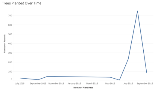
We can determine that most trees were planted in August of 2016 just by hovering over the maximum point on your line graph. You should also be able to determine that the number of trees planted increased over time.
Making a Map
Great! Now let’s move onto one of Tableau’s most powerful visualizations: the map. First, we will need to create a new sheet. Hover over the tabular menu on the bottom of your screen and click the icon that says “New Worksheet”. This will open a blank sheet for you, let’s rename it to “Edible Tree Map”.
If you remember from looking at the data, there seemed to be two fields that resemble a latitude and longitude labeled Y and X, retrospectively. Sometimes, Tableau can automatically generate Latitude and Longitude fields from address or country fields but it did not in this case. Therefore, we will have to tell Tableau these data types:
- Click on the dropdown on the X field.
- Go to “Geographic Role”.
- Select Longitude.
- Click on the dropdown on the Y field.
- Go to “Geographic Role”.
- Select Latitude.
- Now, drag X to Columns and Y to Rows.
You should now see a map with a single point in the Portland, OR area. This is because Tableau is automatically taking the average of the latitudes and longitudes and placing them in one data point. We want to see the latitude and longitude of each tree as their own data point, so we must add “detail”. To do this:
- Find “Object ID” under measures. This is an ID given to each tree recorded, which has a latitude and longitude associated with each one. However, since the ID is a number, Tableau is reading it as a measure.
- Convert Object ID to a dimension.
- Drag Object ID to “detail” under the Marks panel on the left side of the map.
- There are a lot of data points in this field. You may get a pop up from Tableau asking if you want to include all of them. Say yes for now and we will filter some out in the next few steps. Now, zoom into the map to find the area you want to focus on. For this tutorial, we will be zooming into Revolution Hall (Roboboogie’s home!).
- If you are having trouble finding a location without street names, you can edit the map layers.
- Click on Map in the top menu.
- Select Map Layers…
- In the menu that opens on the Left side of your screen, check the box that says “Streets and Highways”.
- Exit the Map Layers menu. We want to select an area of the map that has a radius of about 500ft.
- To do this, hover over your map and a small menu with icons will appear.
- Hover over the arrow in the last option to open map selection options.
- Choose the radial selection option. (See below)
-
- Select an area of about 1000ft by clicking and dragging to create a circle.
- Once you create the circle, you will see a menu pop up like below.
-
- Click “Keep Only” and this will exclude all data points except for the ones you have selected.


Great! Now let’s add some meaning to the dots on your screen. You will see that there is a data field for Edible under Dimensions. This field will tell you whether the tree is a fruit tree, a nut tree, or not edible. Let’s drag this field to Color under the Marks panel. You will see that Tableau changed the colors of the dots to correspond with the new menu on the right.
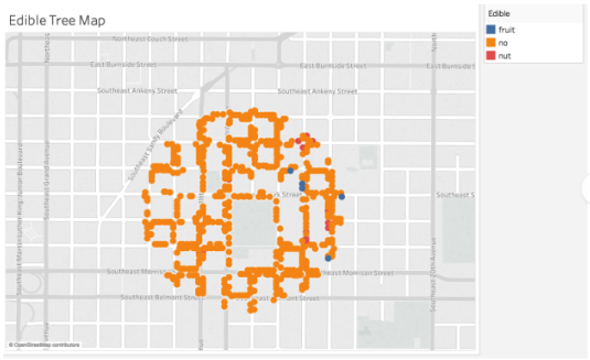
However, “no” and “nut” are very close in color. Let’s edit the colors to provide more contrast:
- Click Color in the Marks panel.
- Click “Edit Colors”.
- Change the colors for each variable to provide more contrast by clicking on the variable you want to change then clicking on the color to change it to. You can see more colors available by changing the color palette.
- We chose blue for fruit, green for nut, and red for no.
- Press OK.
Now your visualization should look like this.
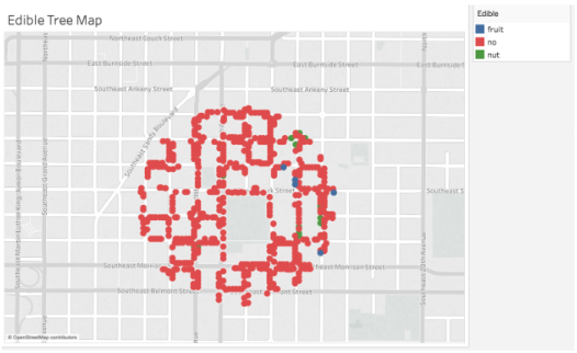
You can now easily see which trees are edible in your area!
What Else Can I Do?
Tableau is a wonderful tool with many possibilities, and this tutorial only touches the surface. Try clicking on the “Show More” menu in the top right corner to explore other visualizations you can create. You can also look through the Tableau Public Gallery to see other visualizations people have made using this tool.
There are many public data sets online that you can download and visualize in Tableau. We have made a short list here but there are many more available, all it takes is a little Googling!

Roboboogie is an eCommerce Performance Consultancy. We provide a measured approach to improving website performance and some might say we’re obsessed with performance. Get in touch to learn more and see what we can do to help you make sense of your data.
**This tutorial was written by Haley Tuttle, and created with inspiration from Human Centered Design and Engineering Staff at the University of Washington. The public dataset was created with inspiration from Brock Craft at the University of Washington. Making a visualization of edible trees was inspired by Tyler at Roboboogie.**


