Don’t forget: Optimize those URLs!

Close up of url bar showing a lock and https

When you’re planning on launching a website, a great deal of work and thought goes into the site content, UX/UI design, architecture and analytics tracking. Sometimes it is easy to focus all a team’s energy on the flashier components – and forget to sweat the small stuff.

One core task that can get brushed over is strategizing the perfect domain and URL structure for your upcoming site launch. You could have a really beautiful website with a pristine architecture, amazing and compelling content, clear CTAs, and impeccable design, but if you don’t thoroughly think through what the URL will be (something you will be advertising for years and years), your URL could end up looking comically ridiculous, like this:

Very long url in print

Yeah, let me take 15 minutes of my precious time to type that keyboard mash URL into my address bar. I’m sorry, crappy newspaper ad, but I and thousands of other people will never begin that application process.

It will take some extra time, but irritating your potential user can be prevented. It will be much easier to front-load this work in your team’s process to encourage your viewers to come back or, hell, even visit the first time. Don’t know where to start? Here are some important things to acknowledge when picking your desired URL.

You must consider the UX of URLs and domain names.

This is important not only for the obvious SEO benefits, but also for catering to the experience of the user who will be typing this URL out in their address bar, especially on mobile devices. If the URL is extremely long, there’s not a chance you’ll see me typing that into my phone on-the-go.

A usable site requires a domain name that is short, easy to remember, easy to spell, and easy to type. The more readable, the better. You get much more word-of-mouth exposure if it’s a name you can easily say without having to spell it out.

You want avoid this potential dive bar conversation:

“Hey man, you like beer?”

“Well golly gee, I sure do.”

“Well, you’re in luck. Check out my beer comparison site my bros and I launched last month. We find cheap grocery store alternatives to expensive beers and help you find the closest store location that sells that beer dupe.”

“Wow. That sounds great. Exactly what I’ve been looking for. What’s the link?” *takes out mobile phone*

“It’s simple really, ‘www.bros_berankingb33rs.net/index.html Don’t forget the E’s are threes in the word beers.”

“F**k you, dude. No thanks.”

A properly structured website will carry a range of benefits.

It is crucial to understand that your website’s content must be part of a comprehensible, meaningful site architecture that allows you to scale over time.
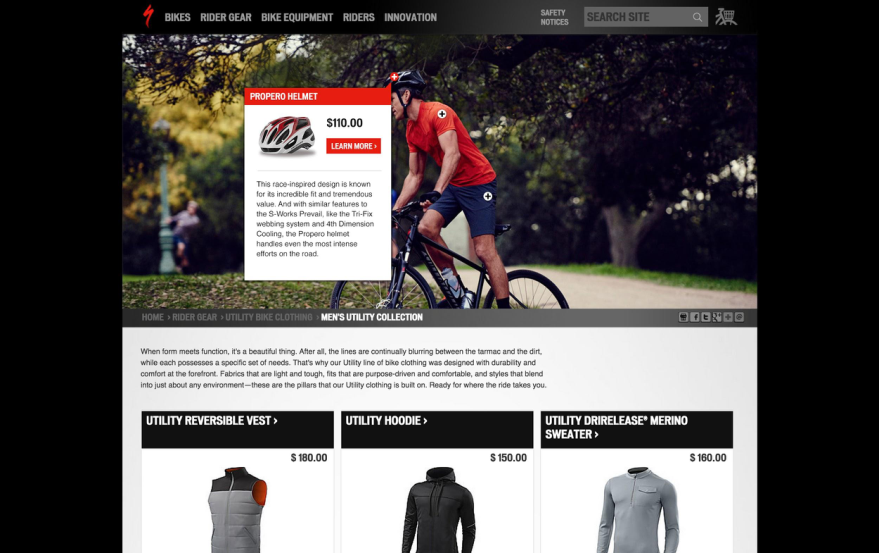
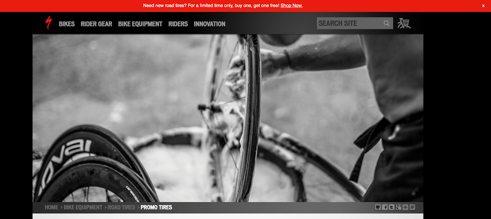
Another example, Reddit does a good job of getting users to understand their subreddit link structure: www.reddit.com/r/animalsbeingjerks. To view a subreddit, the name of the subreddit needs to be accompanied with /r/. As a user, it’s muscle memory for me to type out wwww.reddit.com/r/ because visually, I understand that subreddits are not a part of the main navigation.

Clean, easy-to-understand URLs help users clarify where they are and where they want to go. Search engines like Google and Bing are getting more advanced and closer to understanding natural languages and thought processes, so they should be considered a user too.

From a SEO perspective, canonical URLS are very important.

Does your site have multiple URLs serving the same content on the page? It will be in your site’s best interest for you to canonicalize them. For example, your homepage could be serving up to 8 variations of URLs.

  • http://www.dogsarecool.com
  • https://www.dogsarecool.com
  • http://dogsarecool.com
  • https://dogsarecool.com
  • http://www.dogsarecool.com/index.html
  • https://www.dogsarecool.com/index.html
  • http://dogsarecool.com/index.html
  • https://dogsarecool.com/index.html

Each of these examples are competing for ranking, serving the exact same content. Pick one URL that you ultimately want users to see and make sure that all variations of your website redirect to the correct URL. When you have one domain and URL structure, there is a better chance that your site will rank higher.

TL;DR

Optimized URLs are for both search engines and users. If you think strategically about your URL structure, your website will be both more trustworthy to users and likely to rank higher in search engine results pages. Instead of getting verbally abused, you can successfully get that cool dude to view your beer comparison website and tell all his bros about it.

Written by Jesi Wu.

Optimization Deconstructed | Part V: Key Components of Experience Design

Rider on Specialized bike doing bike tricks

This week the Optimization Deconstructed series is taking a closer look at a vital component to the work we do here at roboboogie, experience design. We’ll talk you through our process and circle back to how it relates to the optimization work we did for Specialized Bikes.

The Necessity of Effective User Experience Design

User Experience Design, or UX design, is the process of enhancing user satisfaction by improving the usability, accessibility, and pleasure associated with a digital experience. As users connect with the brand through thoughtful and intuitive UX design, businesses see gains in lifetime customer value and web performance. Therefore, customer satisfaction is key for brand engagement and success. If customers enjoy a digital experience, they are far more likely to come back to the website to repurchase and remember the brand in the future.

Digital Experiences: A Customer-Oriented Approach

Creating a user-friendly, intuitive interface is essential for the user associating the brand with positive experiences. This lasting impression of a brand creates customer value: customers are likely to repurchase and recommend the brand and its products to friends. When companies choose not to cater towards the customer in their brand design, customers lack the ability to connect and feel valued.

Specialized Bikes embedded shopping empty
Specialized bikes embedded sopping

The Process of Wireframing

Wireframing is the process of creating the blueprint for digital experiences. Typically, wireframes begin as low-fidelity, black-and-white “skeletons” to focus on functionality and eliminate distraction due to color.  The process begins with sketches and later evolves to one of our wireframing platforms (check out our Interview with roboboogie UX/UI Designer Lacie Webb for more on this process). The mockups are created with as much real content as possible to best showcase the end user experience. This basic framework for the site designates places for links to go, calls to action, buttons, modals, and an overall experience flow to satisfy the user and client. The mock wireframe version allows the designer to test out the different elements and make sure its functionality is implemented with the design. Users must be able to find what they are looking for on the site and be able to enjoy the brand experience online.

Tools We Use

For the wireframing process, we use state of the art tools such as Axure, Balsamiq, OmniGraffle. Each tool has different features and benefits for the wireframing process.

  • Axure allows the designer to create user flows, click-through wireframes, and fully interactive live wireframes for the client to explore. By bringing the design completely to life, the designer and client can guarantee that its focus upon user-design is at the forefront.
  • OmniGraffle is a diagramming and digital illustration application that allows users to create and edit website wireframes. It has a simple and accessible format allows designers to quickly share design mockups to fellow designers or clients.
  • Balsamiq is a wireframing tool that replicates the experience of sketching a design on a whiteboard on a design program.

Each wireframing tool we use has a different purpose, but together they allow us to create a wireframe design that satisfies the needs of the client and is easily accessible for the user. Ultimately, designer preference and client needs determine which tool is best for a particular project.

Specialized Bikes: Increasing Navigation Engagement by Design

One focus area with Specialized Bikes was making incremental experience design improvements to primary and contextual navigation. Through our design process, we worked to integrate more visible, directed path to products –  helping to bridge the gap between the site’s dual business goals to becoming a thought leaderships hub, as well as a shopping destination. Through a series of testing campaigns to rework primary navigation, introduce in-line and contextual paths to related content, we were able to optimize the existing user experience to provide the most value for users. Through final implemented navigation-focused user experience updates, we were able to observe:

6.5%

Increase in navigation engagement

 12.1%

Increase in revenue 

For each step in the optimization process, we would first show wireframes to the client. Once approved, we would provide visual comps of what the added or updated user experience would look like in live time. The rapid testing style allowed us to work closely with the client to update wireframes or designs to as we learned more about our audience and their needs. When the customer enjoys the user experience, the business will observe conversion results.

Look out for Part VI Next Week

Stay tuned next week for the final installment of our Optimization Deconstructed Blog Series, Using Data to Inform Strategy. New to our Optimization Deconstructed Blog series? Check out our last post, Part IV: Elements of Personalization, to take a look at the personalization campaign we created for Specialized Bikes.

Contributors: Andrea Pappoff, Duncan Lawrence, Etain O’Longaigh, Jedidiah Fugle, John Gentle

Narrowing In On What Success Looks Like with Opal Labs’ Andy Hugelier

Networking groups at roboboogie's Camp Optimization

On September 14th, Camp Optimization returned after a two-month summer hiatus – and we couldn’t have been more excited. The event was held at the Assembly Lounge at Washington High School, where we were joined by Opal Labs’ Director of Design, Andy Hugelier.

Welcoming Andy Hugelier

Andy is a designer by trade with an agency background, who joined the team at Opal about two-and-a-half years ago. He was interested in the problems they were solving there, and has learned a lot along the way about measuring success, which can sometimes be an unclear process. Andy’s presentation, “What does success look like without a clear KPI?” revolved around this very subject. He walked us through some of the challenges he’s faced, and strategies he’s utilized for measuring success in an ambiguous environment.

roboboogie's September Camp Optimization's Speaker, Andy Hugelier

Opal is a collaboration platform for brand marketing teams. It offers a single space for teams to work on a project from beginning to end, and serves to unite the marketing organization. The platform is utilized by many different types of teams, from large global teams, to disparate teams and silos – both big and small. Through the tool, teams can ideate around marketing strategy, develop a content roadmap, create and collaborate on content, while having the visibility to know exactly what their brand story is going to look like before it’s out to market. The innovative and visionary teams that the company works with (such as NASA, Apple, Nike and Burberry) help push the platform the be as good as it can possibly be, simply by doing their jobs.

The Challenge

It’s no wonder Andy has so much insight into the subject of success measurement! He explained that he’s always struck by how collaboration affects project outcomes, and that his main goal is to help teams do their jobs better. But with teams and projects with such diversity, how can this be understood and measured across the board? He admits that it is complicated to understand the dynamics between teams and how they work together, especially as their behavior changes while their experience using the platform matures. But with some intentionality and process, trends become clear. “It all begins with taking a closer look at what collaboration means to different teams. For example, you can observe a global brand team and a small design team working with the same tools, and see wildly different patterns occur based on who’s using the tool and how the group interacts with one another,” Andy explained. Each team, and the agencies connected to them, have very specific needs that drive their engagement and progress. This can make it tricky to evaluate performance.

First round of drinks courtesy of roboboogie at Camp Optimization

Step 1: Break things down into smaller, more measurable parts

Especially with a fluid product such as Opal, it can be daunting to develop a measurement approach, however Andy discussed a few simple steps to better understand and define success. The first tactic Andy applies to illuminate success is breaking things down to take a closer look at each phase or step in a process. This involves getting a better understanding of the people working within a team, and how they approach a project. User archetypes, he explained, can be very helpful with this process. Archetypes can be created and mapped to various responsibilities a team has, and to observable repeated patterns. Some archetypes he’s worked with in the past include “the Creative,” “the Strategist,” “the Manager,” and “the Stakeholder.” By looking at the archetypes and attaching them to a specific user, patterns can be segmented to gain a better view of what is important to each archetype, and which outcomes will result. From individual archetypes, we can make the jump up to team archetypes. Because the behaviors of a user are dependent on the teams they operate within, it’s important to also get a grasp of what the team’s needs are. For example, teams at an agency will have different needs than one at a studio, or a company’s regional brand team. Not only will their needs differ, but they’ll also have different personalities and decision-making styles. A large company like Apple or Nike will adopt a top-down decision-making style, whereas a small creative agency will likely distribute decision-making amongst the team. By understanding the dynamics of both users and teams, one can gain a better idea of what’s working for a particular team, and what’s not.

Andy Hugelier of Opal Labs presenting at roboboogie's Camp Optimization

Step 2: Focus on a smaller sample set

The second tactic Andy applies for measuring success in an ambiguous environment is to focus on a smaller sample set, instead of trying to look at all data across all users. User testing is great to focus on for validating an idea initially. There may be similar teams that use a platform for different reasons, so it’s important for data to not exist in a vacuum. Looking at a smaller set of data from different angles allows one to learn more about situational factors, and better informs beta testing efforts. By working out any kinks on a smaller scale, go-to-market risks can be reduced to help ensure long-run success.

Step 3: Understand the outcome

The third tactic Andy spoke about was making a conscious effort to understand what the outcome of collaboration needs to be. After processes have been broken down into smaller parts, and a smaller sample set has been focused on, metrics can be identified to indicate whether a process has been successful. Has a team accomplished what it intended to? Has their timeline become more efficient? Are they able to communicate less frequently, but more effectively? Depending on the nature of collaboration, these metrics can vary quite a bit. By turning qualitative data into quantitative data, it becomes clearer how collaboration affects an organization. Looking at successful users, and using them as a model to reverse-engineer what success looks like can help with this step. Andy’s goal is to ultimately develop a litmus test of what the outcome of good collaboration looks like. For now, the core tenets he relies on are visibility, alignment, and efficiency.

Networking groups at roboboogie's Camp Optimization

Can failure be predicted?

Andy also spoke about factors that indicate when a team is going to fail. He explained that a Customer Success Team is an important element in understanding who’s interacting with a platform, and what their goals are. By providing support to users and checking in with them throughout their process, it can be easier to understand when things are working, and to identify opportunities to intervene when necessary. Andy noted that generally speaking, a smaller, more isolated team will face more challenges with scaling within a company compared to an initial company-wide adoption. “A tool is only as powerful as the amount of people who are involved,” he explained, and mentioned that company culture also plays a big role in defining and achieving success. Teams with an attitude of wanting to reinvent their processes to figure out a better way to work are much more likely to succeed. On the opposite end of the spectrum, teams who are attached to their current methods and simply want to become faster at what they do will face significantly more challenges, as process improvements are fighting against the existing company culture. Being open to new ways of collaborating is vital to creating an environment for success.

Networking groups at roboboogie's Camp Optimization

Thank you, Andy, for sharing your insights with us! Mark your calendars for our next Camp Optimization meet-up on November 9th at Buckman Public House, where Silas Sao of Cloudability will join us to talk about the importance of ADA Compliance and making the internet more accessible.


Who is roboboogie?

roboboogie is a Portland-based digital design and conversion optimization agency, partnering closely with brands to improve conversion rates, nurture brand advocacy and increase customer value.

Who is Opal?

The Opal Platform is designed for marketing team collaboration, facilitating the production and orchestration of the brand marketing process. Opal’s StoryFirst™ Framework enables brands with an efficient structure, reducing complexity and aligning teams so they can produce brand stories that connect and perform.

Optimization Deconstructed | Part IV: Elements of Personalization

Two people riding Specialized road bikes

Let’s Talk Personalization!

Welcome back to our blog series, Optimization Deconstructed! This week we will be discussing personalization – an essential step to increase value, solve user-specific needs, and reach new demographics. Personalization is best harnessed within an already well-performing, optimized experience. Learn more about our approach to experimentation to maximize conversions, checkout our post Optimization Deconstructed | Part III: Elements of Experimentation.

The Power of Personalization

Personalization allows brands to target a user or group of users with a different experience than a completely anonymous user would encounter. It can help collect and track customer behavior to deliver targeted brand and product messages. Users want to feel engaged, and by making a web experience catered towards their needs, conversion rates increase.

A number of platforms on the market have powerful personalization tools that implement customer segmentation analytics and allow businesses to understand how to target their users. Users can be targeted based on their past engagements with a site, usage history, user preferences (as illuminated by analytics), product purchases, timezone, demographics, persona, and many other references.

A Personalization Plan for Specialized Bikes

As the shopping experience began converting at target levels, our Optimization Roadmap for Specialized Bikes involved harnessing personalization to further enhance the user experience. One particular campaign that saw great success was an initiative centered around driving awareness for product-specific sales to users who had previously shown interest. Optimizely’s personalization tool made it possible to track customers who previously visit specific content. They were placed into a segment that was served a buy-one-get-one offer through a campaign called Let’s Go Dutch. We used Optimizely’s personalization tool to serve this unique offer (and experience) to the group of users who visited three separate road tire product pages. These users were presented a simple red butter bar that encouraged them to participate in the promotion. We then used A/B testing to optimize messaging strategies throughout the campaign.

Given limited internal dev resources for this promotion, as well as abbreviated project timelines, roboboogie stepped in to make nimble changes on their site; serving messaging and hosting site changes through the Optimizely dashboard.

Specialized bike riders with their bikes in the back of a truck

The Solution:

Target marketing through Optimizely’s personalization features

In the two months leading up to the campaign, the roboboogie team collected a personalization target list by setting up a ghost experience to determine which users were actively looking for tires. Users who met the criteria under that experiment were added to a custom audience in Optimizely. The users who made it into this audience then saw a unique promotional content bar during the final BOGO campaign, giving them extra visibility into road tire deals.

Buy-One-Get-One offer from the Let's Go Dutch Campaign

Utilizing Optimizely for testing, goal tracking and CMS (content management system)

Utilizing Optimizely as not only a test tool, but to push content as a CMS, allowed the team to promote and implement tested messaging on appropriate road tires. This strategy also allowed us to instruct users on how to participate in the sale on the campaign tire pages on mobile and desktop, without the assistance of an occupied Specialized development team.

Offer example from Let's Go Dutch campaign

 The Impact:

  • Road tire inventory sold out in less than a week –  months ahead of expected sell-out date. (Additional product was added shortly after and has continued to thrive through personalization and added messaging.)
  • The strategic messaging addition boosted add-to-carts by 11.4% on desktop and 7.3% on mobile.
  • Personalization efforts boosted add-to-carts by 18.1%, and overall site sales by 21.4%.
  • Revenue generated through personalization experimentation alone has provided more than four times the monthly combined cost of Optimizely platform and roboboogie agency services.

21.4%

Revenue increase

And most importantly, a happy Specialized team, excited about ramping up personalization efforts due to impact of personalization efforts with the Let’s Go Dutch campaign.

Part V Coming Soon!

Stay tuned next week for Part V in our Optimization Deconstructed Blog Series, Key Components of Experience Design. Want to start Fresh? Check out Part I: Foundations of the Industry.

Optimization Deconstructed | Part III: Elements of Experimentation

Specialized bike riders in city setting

Let’s Talk Testing!

Welcome back to our Optimization Deconstructed blog series! This week we will be discussing the elements of testing – an essential step in any optimization process. Throughout our optimization efforts, we utilize different experimentation strategies to gain qualitative and quantitative data. By harnessing this user data, we design solutions that meet customer needs and generate maximum ROI for our clients.

Specialized homepage with logo redesign

A/B & Multivariate Testing

A/B testing is the process of evaluating multiple variations of an experience against each other in a controlled experiment environment. It can be in the form of an ad, email or onsite UI, but always involves running a large sample of users (at random) through each variation to identify trends. To be most accurate, and to allow for iteration, experiments should isolate a single variable so that the resulting impact on user behavior can be attributed to that specific change. This style of testing is called “A/B,” but most commonly will have more variations. We have even run experiments with 18 different copy variations in one test! The most common application we apply is a technique called multivariate testing. This approach allows us to introduce multiple variables (multivariable), by running each combination of variables as a tested variation. We are then able to triangulate the impact of each variable through the overall test, and from there determine the optimum combination.

However, sometimes due to a need to move more quickly, or with a limited amount of traffic to the site, other techniques can be applied. A common method in this scenario is called Design Validation. With this approach, larger sweeping changes are made often to a whole ad theme, email template, page or series of pages (like a checkout flow), and the original is then tested against the new experience. In other words, validating that the new experience is a stronger performer than the original. This type of testing is best served in combination with deeper analysis or a layer of qualitative feedback to learn more about the specific elements that are resonating with users.

In order for our testing results to properly inform our decisions, we need to achieve statistical significance. This requires a high amount of traffic, normally pushing tests to run longer on low-traffic websites. For websites where statistical significance may be unobtainable due to low-traffic, however, we encourage our clients to wait for at least 1,000 users per test variation before moving on analyzing results. We then combine test learnings with additional site, behavioral or qualitative data to triangulate learnings with reliable impacts.

Moving Forward with the Best Approach: The Optimization Roadmap

Before selecting and implementing our testing strategies, we use experience and analytics audits to understand the marketing ecosystem, understand our users, and to define our testing goals and parameters (learn more about this process in Part II: Fundamentals of Optimization) . We use the insights gained from the audits as well as a strong understanding of business needs and desires to inform our optimization approach – what we call an Optimization Roadmap. Within that framework we look at opportunities for quick fixes, larger sweeping changes, and places we see largest growth potential through pushing the current experience via iterative testing to maximize the potential of a current marketing campaign or design. Personalization can also be a big part of a site’s optimization efforts (but more to come there next week!). As we test and optimize through our roadmap, we monitor the behavioral impact the new experiences have on users to continually learn about our user base. This attentiveness to performance allows us to keep a close pulse on business impact and make changes as needed to maximize ROI.

Specialized Bikes: Usability Focused Experimentation

Through audits of the Specialized Bikes site as well as internal and customer feedback, it became clear one of the biggest opportunities for the brand was through focusing on the usability of the ecommerce experience – and most importantly simply driving awareness that it is an online store. From there we developed an optimization roadmap which focused on improving visibility of shoppable products and shopping features, improving the path to products and cleaning up shopping UI.

Specialized shopping cart icon redesign

One major opportunity uncovered through auditing was a surprisingly low amount of engagement with primary shopping navigation, including product categories and account (including cart) features. A testing campaign (a series of tests as part of the overall Optimization Roadmap) was performed across functionality, copy and styling. One huge, yet simple, success was discovered through testing of the cart icon design – introducing more traditional iconography that was more recognizable to users had profound impact on triggering shopping behavior to begin shopping, and eventually buying, Specialized gear. Campaign success!

7.8%

Shop engagement increase

41.9%

Revenue increase

An internal rule at roboboogie we observe when designing web experiences  is “The Three Second Rule” – and no, not to determine if snacks are safe for eating after they hit the floor – but as a gut check to gauge if we are effectively telling a compelling story to the user in under three seconds. If we can’t, we expect the user will bounce, so creating value that is identifiable at first glance is imperative. Specialized was experiencing a high bounce rate with users unable to understand navigational and functional aspects of their site. A flat structure, with gridded elements and rigid jump-off points, made it less accessible to users. There was also a lack of product differentiation and no feature to assist users to better understand product features and accessories.

Through a testing campaign aiming to drive engagement and improve shopping UI we saw bounce rate decrease, overall content engagement to rise which lead to a higher purchase rate. Another campaign success!

6.5%

Product page views increase

12.1%

Revenue increase

Through iterative testing, and incremental improvements in on-site UI we were able to meet and exceed conversion growth goals via experimentation.

Part IV Coming Soon!

Stay tuned next week for Part IV in our Optimization Deconstructed Blog Series, The Elements of PersonalizationWant to start Fresh? Check out Part I: Foundations of the Industry.

Contributors: Andrea Pappoff, Duncan Lawrence, Etain O’Longaigh, Jedidiah Fugle, John Gentle

Jumpstart your Behavioral Analysis with Custom Event Tracking

What can Google Analytics do for you?

Google Analytics has long been a staple product for businesses to monitor user behavior on their sites, largely due to it’s ease of implementation, collection of easy-to-use standardized reports, dimensions and metrics, AND it’s free. While you can gain valuable insights just from an out-of-box implementation, the foundation of Google Analytics is built upon pageviews and not events, which might not translate to how you’d like to evaluate success on your site. After crafting unique, meaningful, effective digital experiences with proprietary functionality and user interaction functionality, there are gaps between what user behavior scenarios exist and what is measured in GA. However, through the use of custom event tracking, we can understand which content is most compelling to the user, which navigational paths are most utilized, and most importantly, what features or content drive conversions. After layering segments onto this data, such as new vs. returning, mobile vs. desktop, age, gender, etc. we can gain a clearer picture of the customer journey.

Using Event Tracking

Google provides excellent documentation for developers to implement structured event tracking hits on a site or via a tag management solution.  As such, this post will not go into detailing the specific hit construction, and will instead focus on some opportunities for event tracking on an sample site.

Google Analytics Event Tracking feature reporting

Need help implementing or customizing your Google Analytics implementation? We’re here to help!

So what qualifies as an event? Really, it can be any user interaction that occurs on your site: a button click, a form submit, a form field being entered, even a mouse-over event if you really wanted to. Generally, we suggest starting by tracking events that capture performance/interest metrics and unique pathing opportunities, as those should most drastically inform your business on user interests and pathing behavior on site, and what drives each unique audience to convert.

A Closer Look

Let’s dive into The New Yorker as an example site to help frame up the best way to approach event tracking in Google Analytics. Although the possibilities are limitless, we will focus on 3 event tracking themes we have found provide the most value: contextual pathing, form submit success/fail events, and a few examples of user interaction that don’t trigger a pageview event.

1. Contextual Pathing

If we look at The New Yorker, we can see a lot of potential user interactions above the fold. A lot of these will land a user at a new page, which would be captured as a page view within Google Analytics. But take for instance the top left “subscribe” CTA, the red “subscribe” CTA in the header nav, and the banner “subscribe” CTA. These all send a user to the same page, so when we’re analyzing page views we wouldn’t know which offer was driving the most traffic. By tracking each unique “subscribe” CTA with an event, we would be able to track the unique user paths for different traffic sources, demographics, devices, etc, and optimize our site experience accordingly. For instance, evaluating performance of a traffic channel (paid search, organic search, email, etc) might help you formulate A/B testing opportunities to either suppress underperforming CTAs or test promote additional paths/content. 

The New Yorker hompage

2. Form Submit – Success/Fail

The New Yorker unsuccessful form submission

One common user interaction on the website is a sign-in feature to access the full range of content as a subscriber. By clicking the “sign in” CTA in the top right, we’re directed to the account page, and given a form to fill out.

However, let’s say I don’t fill out the form but instead try and submit. The form errors out, but no new page view is fired. Capturing unsuccessful form submits (as well as successful submits) as an event can help an organization triage user experience issues and better understand user flow. Also, capturing form submit successes based on validation of the form versus a “success” pageview also ensures a higher integrity of data, because a thank you page can typically be refreshed or navigated to at a later time, and we wouldn’t want to count these return page views as “successful signups”, given that the form submit didn’t occur simultaneously.

3. Enhanced User Interface Tracking

The New Yorker homepage search feature

Event tracking can also apply to things that aren’t necessarily contextual navigation or form submits. For instance, a useful event to understand user behavior on our site could be interactions with the search icon. 

Google Analytics scroll tracking feature

Because it doesn’t trigger a pageview when toggled, we don’t know the ratio of users who open the search bar but don’t actually search, which might shed light on some user experience issues.  

Scroll tracking can be another useful metric set for long format pages that requires a user to scroll many times before reaching the bottom of the page. You could fire an event as a user scrolls down the page at different milestones (ie. 10%, 20%, 30% etc) in order to track how far users typically make it down certain pages or sections. This could inform design decisions such as contextual navigation, content, and length of page.

In Closing

The key to analytics is intentional data collection. Page views are a great start to understanding the user journey, but events help an organization dissect a user visit in much more detail, giving them the data they need to optimize their site and user experience to convert more visitors into customers. Events help us rank our content by user interest, track performance of forms and offers, better understand user navigation and scroll depth, and ultimately create a better experience that converts.

Stay tuned for our next post in the series “The Importance of Custom Dimensions” coming soon!

Written by: Kelly Burgett

Images sourced from The New Yorker.