Go Back
This week the Optimization Deconstructed series is taking a closer look at a vital component to the work we do here at roboboogie, experience design. We’ll talk you through our process and circle back to how it relates to the optimization work we did for Specialized Bikes.
The Necessity of Effective User Experience Design
User Experience Design, or UX design, is the process of enhancing user satisfaction by improving the usability, accessibility, and pleasure associated with a digital experience. As users connect with the brand through thoughtful and intuitive UX design, businesses see gains in lifetime customer value and web performance. Therefore, customer satisfaction is key for brand engagement and success. If customers enjoy a digital experience, they are far more likely to come back to the website to repurchase and remember the brand in the future.
Digital Experiences: A Customer-Oriented Approach
Creating a user-friendly, intuitive interface is essential for the user associating the brand with positive experiences. This lasting impression of a brand creates customer value: customers are likely to repurchase and recommend the brand and its products to friends. When companies choose not to cater towards the customer in their brand design, customers lack the ability to connect and feel valued.
The Process of Wireframing
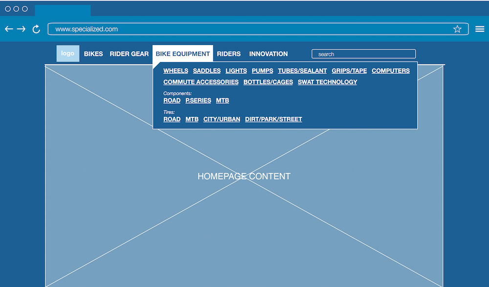
Wireframing is the process of creating the blueprint for digital experiences. Typically, wireframes begin as low-fidelity, black-and-white “skeletons” to focus on functionality and eliminate distraction due to color. The process begins with sketches and later evolves to one of our wireframing platforms (check out our Interview with roboboogie UX/UI Designer Lacie Webb for more on this process). The mockups are created with as much real content as possible to best showcase the end user experience. This basic framework for the site designates places for links to go, calls to action, buttons, modals, and an overall experience flow to satisfy the user and client. The mock wireframe version allows the designer to test out the different elements and make sure its functionality is implemented with the design. Users must be able to find what they are looking for on the site and be able to enjoy the brand experience online.
Tools We Use
For the wireframing process, we use state of the art tools such as Axure, Balsamiq, OmniGraffle. Each tool has different features and benefits for the wireframing process.
- Axure allows the designer to create user flows, click-through wireframes, and fully interactive live wireframes for the client to explore. By bringing the design completely to life, the designer and client can guarantee that its focus upon user-design is at the forefront.
- OmniGraffle is a diagramming and digital illustration application that allows users to create and edit website wireframes. It has a simple and accessible format allows designers to quickly share design mockups to fellow designers or clients.
- Balsamiq is a wireframing tool that replicates the experience of sketching a design on a whiteboard on a design program.
Each wireframing tool we use has a different purpose, but together they allow us to create a wireframe design that satisfies the needs of the client and is easily accessible for the user. Ultimately, designer preference and client needs determine which tool is best for a particular project.
Specialized Bikes: Increasing Navigation Engagement by Design
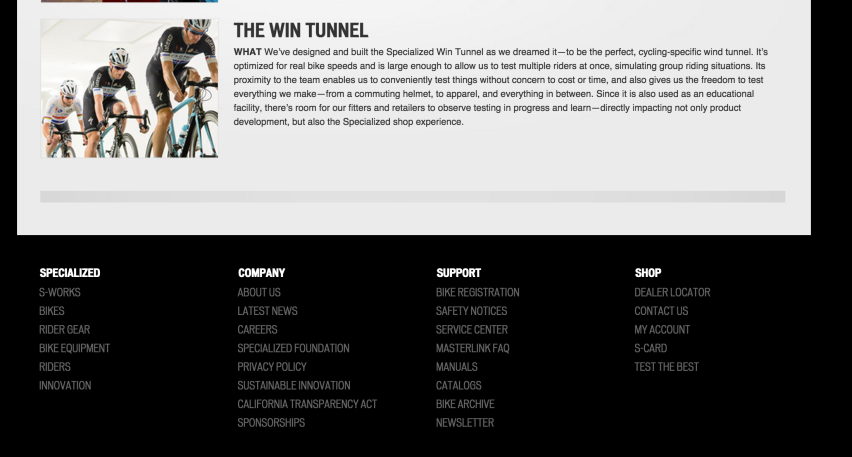
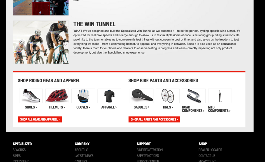
One focus area with Specialized Bikes was making incremental experience design improvements to primary and contextual navigation. Through our design process, we worked to integrate more visible, directed path to products – helping to bridge the gap between the site’s dual business goals to becoming a thought leaderships hub, as well as a shopping destination. Through a series of testing campaigns to rework primary navigation, introduce in-line and contextual paths to related content, we were able to optimize the existing user experience to provide the most value for users. Through final implemented navigation-focused user experience updates, we were able to observe:
6.5%
Increase in navigation engagement
12.1%
Increase in revenue
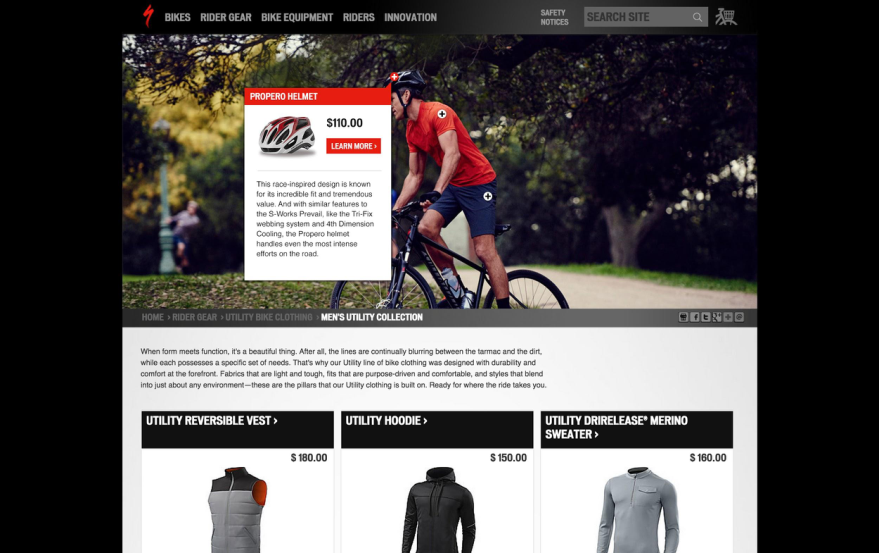
For each step in the optimization process, we would first show wireframes to the client. Once approved, we would provide visual comps of what the added or updated user experience would look like in live time. The rapid testing style allowed us to work closely with the client to update wireframes or designs to as we learned more about our audience and their needs. When the customer enjoys the user experience, the business will observe conversion results.
Look out for Part VI Next Week
Stay tuned next week for the final installment of our Optimization Deconstructed Blog Series, Using Data to Inform Strategy. New to our Optimization Deconstructed Blog series? Check out our last post, Part IV: Elements of Personalization, to take a look at the personalization campaign we created for Specialized Bikes.
Contributors: Andrea Pappoff, Duncan Lawrence, Etain O’Longaigh, Jedidiah Fugle, John Gentle

