Go Back
Let’s Talk Testing!
Welcome back to our Optimization Deconstructed blog series! This week we will be discussing the elements of testing – an essential step in any optimization process. Throughout our optimization efforts, we utilize different experimentation strategies to gain qualitative and quantitative data. By harnessing this user data, we design solutions that meet customer needs and generate maximum ROI for our clients.

A/B & Multivariate Testing
A/B testing is the process of evaluating multiple variations of an experience against each other in a controlled experiment environment. It can be in the form of an ad, email or onsite UI, but always involves running a large sample of users (at random) through each variation to identify trends. To be most accurate, and to allow for iteration, experiments should isolate a single variable so that the resulting impact on user behavior can be attributed to that specific change. This style of testing is called “A/B,” but most commonly will have more variations. We have even run experiments with 18 different copy variations in one test! The most common application we apply is a technique called multivariate testing. This approach allows us to introduce multiple variables (multi–variable), by running each combination of variables as a tested variation. We are then able to triangulate the impact of each variable through the overall test, and from there determine the optimum combination.
However, sometimes due to a need to move more quickly, or with a limited amount of traffic to the site, other techniques can be applied. A common method in this scenario is called Design Validation. With this approach, larger sweeping changes are made often to a whole ad theme, email template, page or series of pages (like a checkout flow), and the original is then tested against the new experience. In other words, validating that the new experience is a stronger performer than the original. This type of testing is best served in combination with deeper analysis or a layer of qualitative feedback to learn more about the specific elements that are resonating with users.
In order for our testing results to properly inform our decisions, we need to achieve statistical significance. This requires a high amount of traffic, normally pushing tests to run longer on low-traffic websites. For websites where statistical significance may be unobtainable due to low-traffic, however, we encourage our clients to wait for at least 1,000 users per test variation before moving on analyzing results. We then combine test learnings with additional site, behavioral or qualitative data to triangulate learnings with reliable impacts.
Moving Forward with the Best Approach: The Optimization Roadmap
Before selecting and implementing our testing strategies, we use experience and analytics audits to understand the marketing ecosystem, understand our users, and to define our testing goals and parameters (learn more about this process in Part II: Fundamentals of Optimization) . We use the insights gained from the audits as well as a strong understanding of business needs and desires to inform our optimization approach – what we call an Optimization Roadmap. Within that framework we look at opportunities for quick fixes, larger sweeping changes, and places we see largest growth potential through pushing the current experience via iterative testing to maximize the potential of a current marketing campaign or design. Personalization can also be a big part of a site’s optimization efforts (but more to come there next week!). As we test and optimize through our roadmap, we monitor the behavioral impact the new experiences have on users to continually learn about our user base. This attentiveness to performance allows us to keep a close pulse on business impact and make changes as needed to maximize ROI.
Specialized Bikes: Usability Focused Experimentation
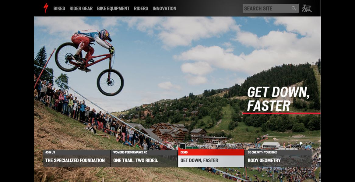
Through audits of the Specialized Bikes site as well as internal and customer feedback, it became clear one of the biggest opportunities for the brand was through focusing on the usability of the ecommerce experience – and most importantly simply driving awareness that it is an online store. From there we developed an optimization roadmap which focused on improving visibility of shoppable products and shopping features, improving the path to products and cleaning up shopping UI.
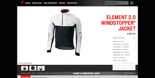
One major opportunity uncovered through auditing was a surprisingly low amount of engagement with primary shopping navigation, including product categories and account (including cart) features. A testing campaign (a series of tests as part of the overall Optimization Roadmap) was performed across functionality, copy and styling. One huge, yet simple, success was discovered through testing of the cart icon design – introducing more traditional iconography that was more recognizable to users had profound impact on triggering shopping behavior to begin shopping, and eventually buying, Specialized gear. Campaign success!
7.8%
Shop engagement increase
41.9%
Revenue increase
An internal rule at roboboogie we observe when designing web experiences is “The Three Second Rule” – and no, not to determine if snacks are safe for eating after they hit the floor – but as a gut check to gauge if we are effectively telling a compelling story to the user in under three seconds. If we can’t, we expect the user will bounce, so creating value that is identifiable at first glance is imperative. Specialized was experiencing a high bounce rate with users unable to understand navigational and functional aspects of their site. A flat structure, with gridded elements and rigid jump-off points, made it less accessible to users. There was also a lack of product differentiation and no feature to assist users to better understand product features and accessories.
Through a testing campaign aiming to drive engagement and improve shopping UI we saw bounce rate decrease, overall content engagement to rise which lead to a higher purchase rate. Another campaign success!
6.5%
Product page views increase
12.1%
Revenue increase
Through iterative testing, and incremental improvements in on-site UI we were able to meet and exceed conversion growth goals via experimentation.
Part IV Coming Soon!
Stay tuned next week for Part IV in our Optimization Deconstructed Blog Series, The Elements of Personalization! Want to start Fresh? Check out Part I: Foundations of the Industry.
Contributors: Andrea Pappoff, Duncan Lawrence, Etain O’Longaigh, Jedidiah Fugle, John Gentle


