Go Back
Fix these four checkout-flow problems and give yourself the gift of no more abandoned carts and lost sales this holiday season
We’ve all been there–browsing the internet aisles while listening in on a work meeting, you see a great holiday gift for Aunt Molly. You add it to your cart and, after a couple of hours debating if it’s the right gift, you decide to pull the trigger and checkout. She’s going to be so thrilled!
Only, there’s a hiccup and gift buying suddenly goes from a joyous occasion to a hassle. The next step isn’t loading, you don’t remember your password or don’t want to create an account, you also aren’t sure if you can ship to one address and bill to another… and where the heck is the complete purchase button?
You love your Aunt Molly but you don’t have all day to figure out a clunky checkout system, so you move on. You take your money to another retailer with a more customer-centric checkout design.
At Roboboogie, it is our mission to optimize eCommerce conversion rates. And one place we frequently start is at checkout.
Why? Checkout flows contain shoppers who have shown a strong intent to purchase. They’ve added something (or many things) to the cart and have entered the virtual checkout line. We don’t want customers to abandon their carts with their wallets open.
Here are four common user experience issues we see that lead to cart abandonment, and how to fix them, just in time to make sure your products are under the tree.
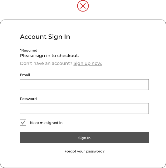
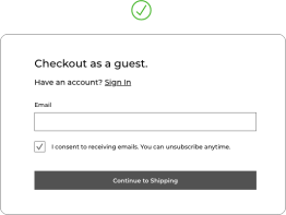
Issue #1: Requiring users to create an account before checkout begins.
While you might think forcing customers to create an account before they make a purchase is a great opportunity to capture email addresses and gain return-users, for customers, it’s a massive deterrent.
For people trying to fill stockings as quickly as possible, creating an account is a huge time suck wrought with uncertainty around how hard it will be and how long it will take. .
Compound this with holiday cookies in the oven, organizing virtual holiday events, and tracking down a mint-in-box Cabbage Patch Kid and a Furby, and you’ll see your customers don’t have the time to mess around.
There are several other issues with this kind of gatekeeping–if any error happens in the account-making process, your customer could be locked out of their purchase.
Also, when you force a user to do something they don’t want to do, they are less likely to complete a purchase or return.
And finally, forcing users to give up personal information may give them the impression that your company wants to spam them with emails. Another possible reason to not buy from you.
Recommendations:
- Offer a guest checkout out of the gate, and allow users to log-in if they already have an account.
- Promote registration on the order confirmation page after they have made a purchase.
- Instead of forcing the user to create an account, offer an incentive, a promo code or free shipping, these may convince them to happily spend their time creating an account.
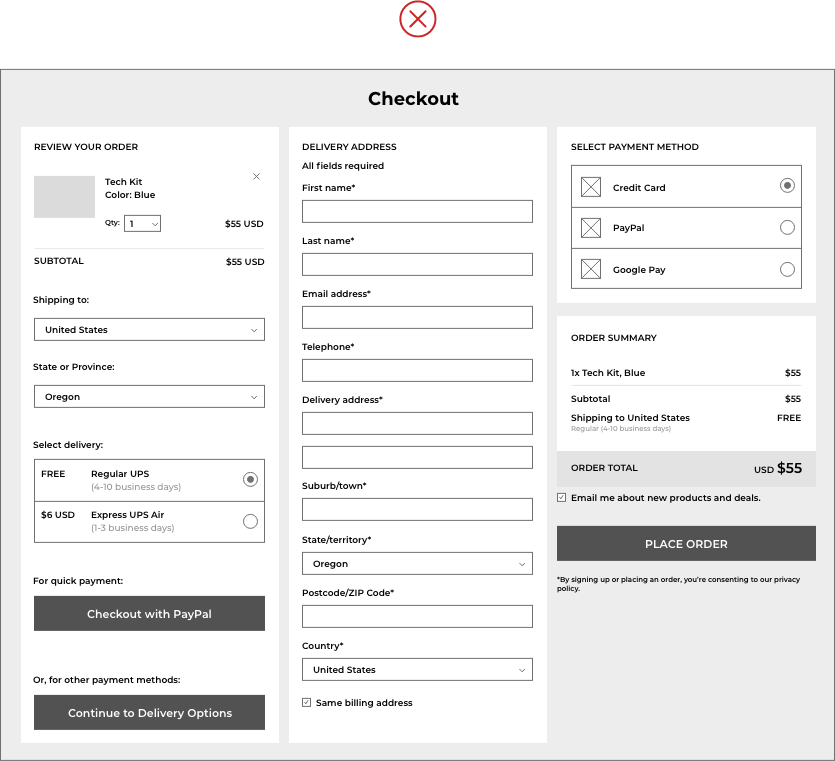
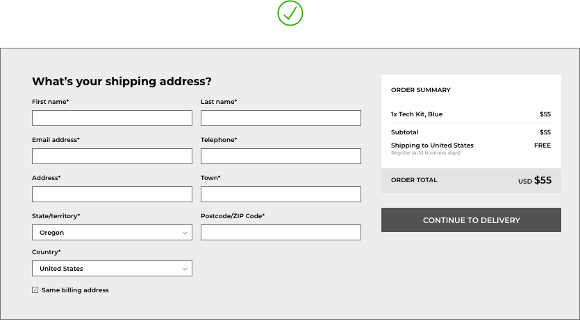
Issue #2: Asking for too much information.
Your site visitors just want things to be easy. Checkouts are often clunky and ask for a lot of information to complete a purchase. If you have a site that requires booking along with check-out (i.e. travel, appointments, scheduled delivery, etc.), or you offer a lot of payment options like financing or alternative payment methods such as PayPal and Google Pay, things start to feel even more daunting. Cramming all of this information into as few steps as possible to make it seem “shorter” will only make things worse.
As an alternative, you can segment the steps of your checkout to make the process feel manageable instead of daunting. It may feel counterintuitive to space your checkout into multiple steps, but the result can make the entire process much more pleasant and logical for your customer.
Recommendations:
- Split the information into categories and then use those categories to create multiple steps. This can even happen on single-page checkouts – space information out in meaningful, intentional ways.
- Reduce the amount of information you require. Less is definitely more in the case of checkouts. Users want it to be as quick as possible. Edit out anything that isn’t absolutely necessary (Do you really need their middle initial?). You can always ask for additional options for information after the sale.
Issue #3: Your website isn’t optimized for mobile.
You need to imagine that many of your customers are shopping on their smartphones because they are! When the mobile checkout experience isn’t considered carefully in the design, customers are going to become frustrated by hard-to-use interfaces and eventually give up.
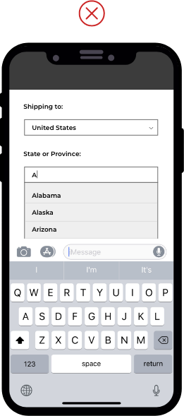
Here are some of the issues mobile users might experience if your checkout isn’t optimized for mobile. The order summary may not be easily visible, or it may be non-existent on mobile devices. The mobile layout may not account for the mobile keyboard, which can potentially take up 50% of the phone’s screen. Customers may not see a “checkout as guest” option presented below the fold and off of their screen. Customers may be unable to see changes to their total price due to additional costs, such as warranty or shipping and delivery costs. Your call-to-action to move forward to the next step might be below the fold preventing customers from completing checkout.
And while we rarely see ALL of these examples presented together, even one can have a dramatic impact on conversions and sales.
Recommendations:
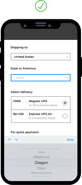
- Provide persistent navigation that leads customers to critical information when it is not currently visible.
- Add progress calls to action at multiple points so the user doesn’t get lost.
- Make sure to provide clear and visible progress indicators.
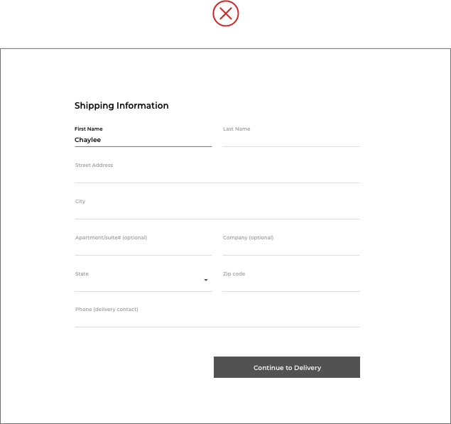
Issue 4: Checkout flow lacks navigation and the flexibility to go back in the process.
Not knowing how long it’s going to take to finish checking out is a frustrating user experience. Users want to get in and get out. Without an indication of how many steps they’ll have to complete, it can feel like the process is taking an eternity – even if it isn’t.
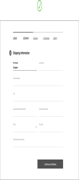
Providing users with a visual indicator of their progress and the ability to easily move back in the process as needed to make a change a better user experience, decreases user anxiety, and increases successful checkouts.
Providing the ability to modify the cart is often a crucial improvement. If users see their progress but are not allowed to return to previous steps to check or change the information they’ve already entered, you may be causing additional frustration. This is an opportunity to let customers easily go back and change their order.
Recommendations:
- Make sure progress is always easily visible at each step, and users can return to previous steps.
- Indicate visually when steps have been completed.
- Allow users to return to previous steps to edit information.
Whether your checkout flow is feeling like a tangled mess of old holiday lights or you’re in a spot to test some subtle adjustments for further optimization, there’s still time to make revenue-generating improvements ahead of the holiday season, so every customer can get what’s on their gift list.
We are here to help! Contact us or email hello@teamroboboogie, to start the conversation.


