Go Back
If you are reading this, you almost certainly have opened and passed through doorways thousands of times. Some wide, some narrow, some with heavy, creaky old doors that are hard to open and some that slide open easily with a simple push.
Clearly, not all doorways are the same.
I want you to visualize a doorway now: a typical plank of wood attach to a frame. But the hinges are old and slightly askew. When grabbing the handle it takes a strong grip and firm tug to shake free from its closed position. Once open the jam of the door is slightly raised requiring a careful step over it to prevent a tumble.
For many, the challenges of opening this door are a mere nuisance or inconvenience. But for others, it is the matter of access. It is a matter of usability. But shouldn’t those who don’t have the same strength or maneuverability as you still have the ability to access what is on the other side?
Now visualize your favorite website.
We all have websites that we love. Visualize one of yours now – preferably one with lots of moving pieces and evolving complexity. Are there any parts of the site that make it a “hard to open the door” for you or others? It may even be something you have never needed to consider before. But what if you are someone with a disability? What if you are color blind? What if you’re hard of hearing?
As web designers and developers, part of our job is to create more ways in which people can open doors for themselves. Here are some steps to get you going in the right direction.
Step 1: Do Some Research
The path to web accessibility isn’t a linear one, but it always starts with research. First, you need to understand what the standards are. You don’t have to float around in the abyss wondering if you’re doing things right; just spend some time reading up on what has already been put into place.
W3C: The World Wide Web Consortium (W3C) is a set of international web development standards across the board. Know that understanding accessibility web standards will be a lot easier if you know where they’re derived from. Make sure you get to know these standards before diving into accessibility standards. (Note: There’s a lot of information here. I recommend reading what is relevant to what you’re working on, and building up a knowledge base over time.)
WAI: The Web Accessibility Initiative (WAI) is W3’s initiative to help make the web accessible to people with disabilities. There’s a lot for both designers and developers to immerse themselves in, including tutorials, techniques, and quick tips. Check out Tips for Designing and Tips for Developing as starting points.
WCAG: Web Content Accessibility Guidelines (WCAG) is a set of guidelines cooperatively created to provide a single set of rules to follow in order for a website to be considered accessible. This is an important one to get to know, as more and more companies will be required by law to reach a certain level of WCAG compliance. Here is a WCAG quick reference that you can use as a checklist as you test your site for accessibility.
These resources only scratch the surface, and the world of designing for accessibility is ever-changing, so be sure to take a continuous learning approach.
Step 2: Create a cheat sheet and a toolbox
Remember how I said there was a lot of information to absorb? I should probably have said too much information to absorb. You’re going to want a cheat sheet. As you learn, take the chunks of information that you find most useful, and put them somewhere you can access when you need. Create a Google doc, write them in a notebook, make them into a zine. Whatever way works best for you. (Personally, I like to hand write my tips, and then doodle next to them so I have a visual as well.) As you create more and more, keep adding to this list, and reference it as often as possible. Soon, you’ll start to memorize some of the items on your list and won’t need to reference it as often. This is a key factor in making inclusive design second-nature to you.
Once you’ve written down the information relevant to you, take it a step further: set up a toolbox of useful websites and browser extensions to streamline your workflow. I’ll leave it up to you to research and build the perfect toolbox to suit your needs, but here are a few of my recommendations:

- Lighthouse: Lighthouse is a tool within Google Chrome’s Developer Tools. It’s already included in the browser, no extension necessary. Nice! (Although they do offer it as an extension as well, if you want to be edgy.) It is an open-source auditing tool that tests against sites for many different purposes, and one of those purposes is accessibility. Simply open Dev Tools when you’re in the browser (cmd+shift+i), click over to the Audit tab, and run an accessibility audit. It will let you know what passed, what failed, and why.
- Colorsafe.co: This is a fun tool to play around with, and I encourage you to explore it. The end result will produce a color palette for you to use that is WCAG compliant.
- WebAIM Contrast Checker: If you quickly want to check if the contrast ratio between your text and background colors pass accessibility standards, this is a nice tool to have. Just input the hex codes of each color, and it will let you know if it passes or fails.
There are many tools out there, and many variants on the tools I’ve provided. Find what works best for you.
Step 3: Remember, people come first
Let’s take a quick pause from all the technical jargon to talk about our audience. Everyone we design for is an individual with thoughts, feelings, and their own way of doing things. Unless we design a site meant to be viewed by exclusively your closest family and friends, it’s pretty much impossible to account for every individual who will view it.
The result is a need to account for a wide range of emotions, motivations, backgrounds, skill-levels and abilities. Effective, strategic design takes into account each audience group to ensure the experience meets the needs of each individual. This includes addressing the needs of disabled users. Integrating accessibility testing into your design process does take time and resources, but meeting WCAG compliance is important to showcase the value of the housed content in an inclusive fashion across all user demographics. If you are getting push back, I encourage you to simply start a conversation with site stakeholders. It only takes one person to stand up and advocate to start moving the needle towards inclusion.
Step 4: Start with visual cues
There are endless ways you can improve a website’s accessibility visually, so let’s hone in on just one for now: visual cues. As should be obvious by the name, visual cues are mechanisms used to convey information visually. They’re arguably the most important part of a website, and doubly so when taking accessibility into account.
Let’s take a look at an example. This is Gmail’s create an account form:
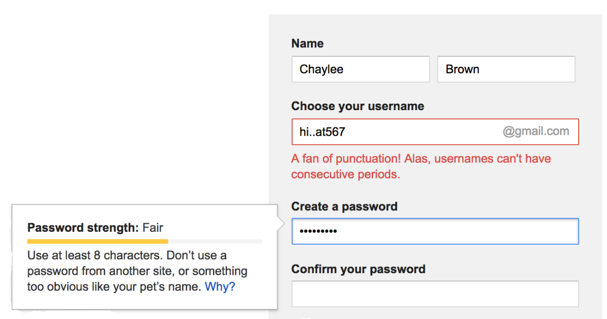
It looks like my amazing username idea produced an error, and Google cheekily tells me what I’ve done wrong. I can also tell how decent my password is. I’m in the yellow, that’s pretty good! (Come on Google, I typed in 123456789 into that password field.) Thanks to the visual cues provided to us, we can easily tell what is happening on this form.
Let’s now look at the exact same form, with the color stripped away.
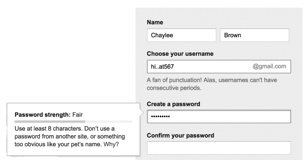
Can I still tell what is happening on this form? Let’s see, after I input my username idea, text appeared beneath the field telling me I can’t have consecutive periods, so I know I’ve made a mistake there. My password strength is looking good, the progress bar is over halfway full and the text tells me it’s a “fair” password. I can also tell which field I’m currently focused on thanks to the inner drop shadow on my selected field.
The reason this is a successful form is because Google is using multiple visual cues in all the necessary areas. If the error state had only been a red outline, people who cannot see color well, or at all, would not be aware of why their form will not submit, so Google provides error text. In the password tool tip, Google is using 3 visual cues: color, a progress bar, and text. I can read that my password is fair, I can see where my password lies on the spectrum of password strength, and if I can see reds, yellows, and greens, I have color telling me how strong or weak my password is.
Providing multiple visual cues that account for the different ways in which people will be experiencing elements on a website is a great practice. Put yourself in others’ shoes, and assess your design decisions from multiple perspectives. Who might have trouble using this, or navigating to that? Inclusive design becomes a lot easier when you are constantly asking yourselves these questions.
Step 5: Get your code in order
There are as many ways to design for inclusion as there are to develop for inclusion. Perhaps even more, since accessing and browsing a site are interactions completely up to the developer. Again, let’s focus on just a few practices for inclusive development.
Responsive design (a site that is created to be viewed on multiple devices) is becoming a standard practice more and more, and it is a big step in the right direction when it comes to accessibility. It should be noted, however, that making a website responsive does not mean you are making a website accessible. Many other factors have to come into play as well, including things that I’ve mentioned above such as color contrast and visual cues. However, creating a site that is accessible from multiple devices is a very solid practice, and I encourage everyone to start doing this if you haven’t already. A mobile view of a website usually puts multiple columns of text into a single column, which makes it much easier to read for users who zoom in a lot. Certain assistive devices will require a responsive design to view it at all, so again, think of your audience and how different people will be interacting with the content you’re providing.
Another big one to call out: CAPTCHAs suck. They just do. We’ve all encountered them, and they’ve all sucked. No one has ever encountered a CAPTCHA and thought, “Wow, I love a little puzzle to solve before I can prove I’m human!”
Let’s take a look at one so we can all remember how much they suck.
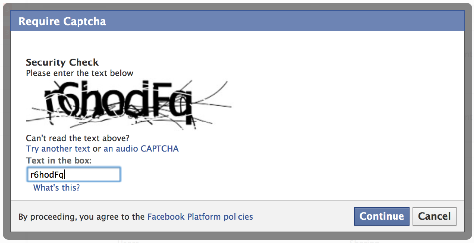
This is an example of Facebook’s CAPTCHA requirement. This is a CAPTCHA that is considered easy to read, but obviously it’s not. CAPTCHAs infer that if you are human, you should be able to read difficult word/number jumbles that have been distorted almost to incomprehensibility, but even as someone considered to have perfect vision, I can only read about half the CAPTCHAs I encounter. There is no way the CAPTCHA system is in any way accessible. Sure, this example offers an audio option, but there are situations in which audio isn’t an option, or is an inconvenience to the user. This unnecessary hurdle then becomes a total shutout to people wanting to access the information beyond the CAPTCHA. The main takeaway here is to stop using CAPTCHAs altogether. Proving you are not a bot is useful to protect information, but can be done in much more elegant ways.
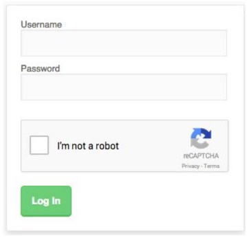
Google’s reCAPTCHA was a breath of fresh air when is made its appearance. A simple checkbox to prove you’re not a robot. Google does all the dirty work for you. No more reading completely illegible pixelated nonsense, but providing the same service. A lovely solution to an accessibility problem that should never have existed in the first place.
Go ahead and get started
If you’ve been following along up to this point, you should see some themes emerging from these steps. Accessible design all starts with including different perspectives in your process. This is the best way to grow and learn, and to keep striving to become a better and more empathetic person. This discussion goes way beyond design and development, but if you start there, inevitably your learnings will bleed over into your everyday life outside of your work. Learn, understand, and share your support with the others around you.
So, whether you’ve been reading in hopes of repairing an old door, or building an inclusive new one, I hope these tips will send you in the right direction. If you have any questions or would like a hand making your site more user friendly, don’t be a stranger!


