Go Back
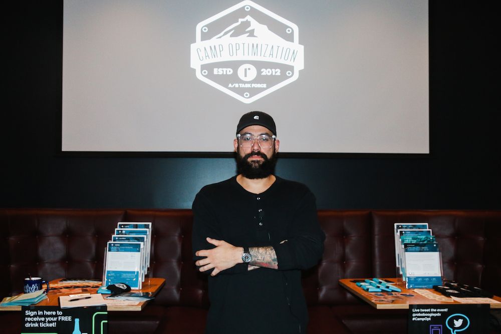
For the November installment of Camp Optimization, we had the opportunity to host Silas Sao, Sr. Product Designer at Cloudability, as he spoke on the importance of making sites and content accessible for all users.

Silas has been crafting web experiences over the past ten years. While most of his work has been in the agency realm working with e-commerce sites, he has also had some exposure to the oil industry and a few non-profit organizations. Silas highlighted his three driving principles for design: empathy, integrity, and transparency. We think these are killer fundamentals to have, no matter what your line of work may be. He also stressed the importance of designing with intention, a philosophy with applicability far outside the agency space.
Now that you have a brief understanding of Silas’ background, it is easy to see what fuels his passion to make the web accessible for all.
First Things First
The first step to making accessibility a common practice is continual research on the topic. If you have made it this far, you’re headed in the right direction. Simply put, web accessibility means people with disabilities can fully use the web without held back by overcomplicated design, structure, or language. There are a few governing entities within web accessibility, which establish guidelines for accessibility.
The W3C (World-Wide Web Consortium) is the primary source for international standards, which also fostered the growth of WAI (Web Accessibility Initiative). There are three levels of accessibility requirements which are broken down into A, AA and AAA. Each of these levels do not exist independently, but instead must be built upon each other. In other words, you must be A certified before reaching the AA level, and so on. For more information on these certifications, check out the “Understanding Conformance” page from Web Content Accessibility Guidelines (WCAG). We hope to see the entirety of the web obtaining the AAA standard in the near future. In order to make it there, the process starts with a firm understanding of the principles of web accessibility.

Web Accessibility Principles
The principles of web accessibility exist to ensure the site is perceivable, operable, understandable, and robust for all users, not just the middle ground. Site perception stems from ensuring users can easily perceive onsite information. Information can not be invisible to all of their senses. A great way to get started on making sure your site is perceivable is to implement text alternatives for non-text content and provide subtitles on multimedia. This simple step allows users who may be visually or audibly impaired to easily understand the implied meaning of an image or video. To ensure the site is fully operable, it is important to give users enough time to read content and to provide help for users who are struggling to navigate and locate specific items. Making the site understandable means providing clear aid when a user makes a mistake, and providing guidance for correction. Finally, to ensure the site is robust, it is important to maximize compatibility with current and future tools that may present themselves to the user. Struggling to remember each of these? Conveniently, they form the acronym P.O.U.R. to drive this important information into your daily practice.

How to Get Started
We realize getting on the road to creating fully accessible sites may seem like a daunting task. Thankfully, Silas highlighted a few important places to start. The main impact points for accessibility can be broken down into:
- Text: A fundamental part of every site, which is sometimes overlooked in regards to accessibility. One way to fix this is the implementation of accurate hyperlinks and ensuring the text is at an accessible reading level, which the industry has defined as a third grade reading level. Taking these two small strides will allow for a larger user base that can readily navigate your site.
- Images: Double-checking to make sure images and video have been assigned alt attributes is also pivotal for accessibility. We occasionally see text encoded over images, but this presents some major issues, as that text is not selectable, searchable, or accessible to screen readers. The software is not able to interpret the text, thus leaving the user without the context of the page. For more on this, check out our blog post about image optimization.
- Design: The key point Silas hit on in the design category was not using color to convey meaning. For example, for a visually impaired user, the overall value will be lost when something negative is displayed in red without any additional context. Providing additional descriptors to coincide with the color allows for interpretation for all.
- Development: From a development standpoint, it is critical to use ARIA landmarks to allow the screen reader to work effectively.
- Testing: Finally we have testing, a personal favorite of ours. Testing in this context goes outside the realm of focusing on improving conversion rates. From a usability perspective, it is important to test usability by conducting tests in various environments, web browsers, or devices that a user may navigate to your page with.
While we all may know what these words mean on their own, it is vital to put them into an accessibility context. Silas highlighted a quote from Dan Formosa, co-founder of Smart Design, that really resonated with our team:
If we understand what the extremes are, the middle will take care of itself.
Looking to Learn More?
We realize the overload of information may seem a bit daunting, but improvement starts with awareness of the situation. As we continue the push for web accessibility practices to become standardized, we will begin to see the positive impact across the web. Here are a few of Silas’ recommendations for useful places to start:
- Web Content Accessibility Guidelines
- Accessibility Courses
- reddit’s Accessibility Community
- Breakdown of Certification Requirements
If you missed out on Silas’ presentation, we have another great event planned as we dive into the new year. On January 18th, Camp Optimization is happy to be hosting Kim Toomey of Lytics as she delves into the importance of personalization. We are excited to get the chance to hear Kim speak on the topic, and we can’t wait to see the crowd in January.

What is Camp Optimization?
Camp Optimization’s mission is simple: provide a casual, fun and informative forum for digital marketers and technologists to share optimization best practices, challenges and wins.
Who is roboboogie?
roboboogie is a data-driven marketing, design and optimization agency from Portland, OR. We combine creative design and marketing science to create digital experiences that delight customers and ensure marketing success.
Written by Tyler Hudson


