Go Back
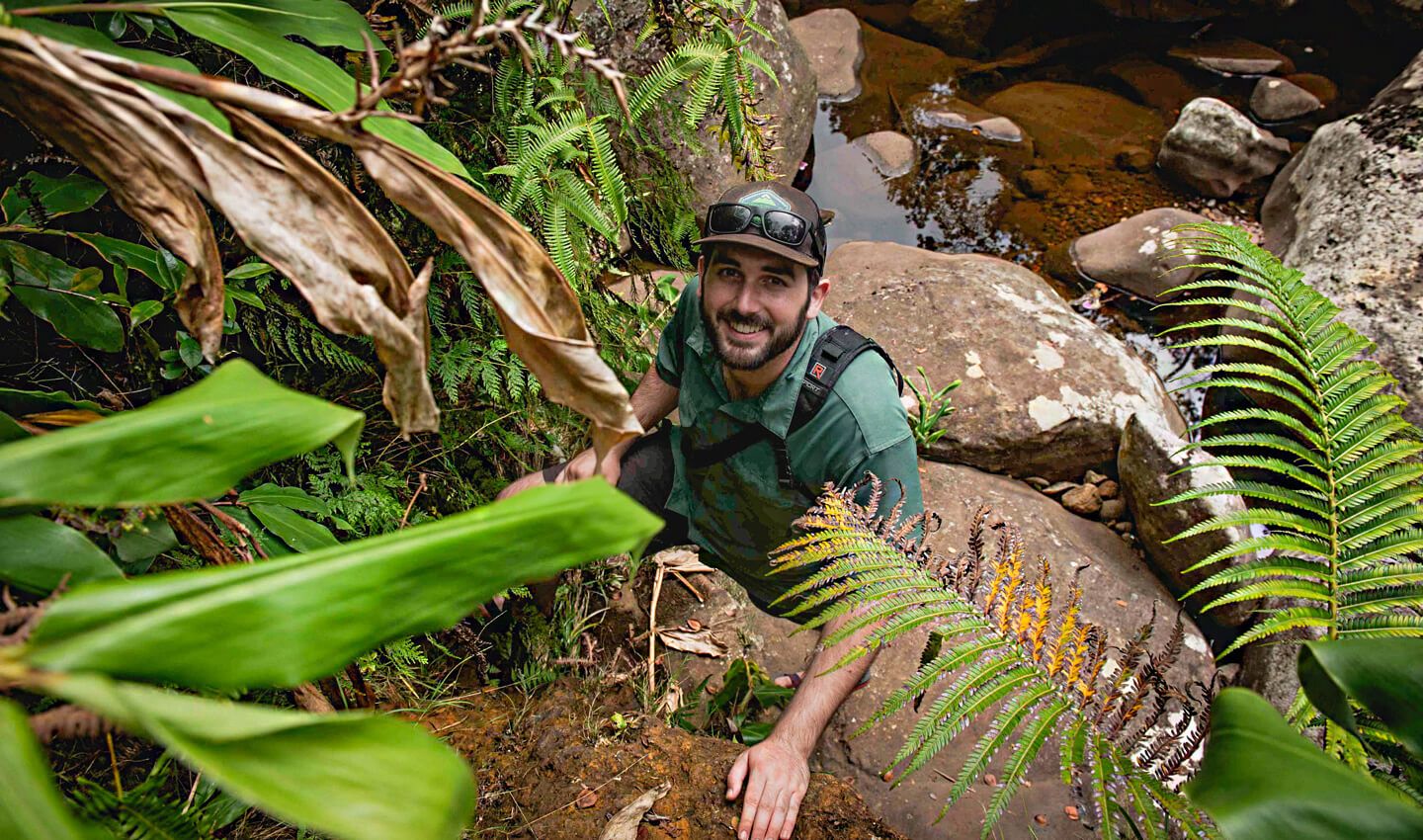
Ever wondered who takes the big ideas at Roboboogie and makes them into real, living things? Meet Strategic Designer, Chase Farrell. This month, he was kind enough to sit down and tell us a little about what he does.
How do you describe what you do?
I like to view it as bringing our client experiences to life — whatever stage an idea is in. If a project is in the beginning strategic phase where it only exists as a concept, I help build out what that experience could look like using wireframes to represent a visual hierarchy. If a project already has a structure and we need to get it ready to live in the real world, I help create the design by applying brand aesthetics as well as using the latest trends and best practices to get it to where it needs to be.

What are the most satisfying parts of your role?
I love being able to apply my skills and experience to solve problems, but the magic for me is when a client or team member lights up with excitement over a solution I’ve provided. It feels super empowering to utilize modern tech to create best-in-class experiences (whether that’s a full landing page design or even something as simple as creating a custom emoji to add to our slack channel), so when the stars align and everyone is high-fiving over the final product, I’m a happy camper.
What made you want to work in design?
There’s a sweet spot with creativity that allows you to make something that feels just beyond what you theoretically should be able to do given the available resources — whether it’s tools, skills, or experience (i.e. fake it til you make it). I fell in love with design because for me it’s a continuous journey where I can keep improving while constantly trying to outpace myself along the way. When I intentionally challenge myself to create something that’s a step ahead of where I currently am, I end up learning something that moves me forward — just in time for me to set my sights on the next best thing.
What is a design-related skill you feel you’ve improved on the most recently?
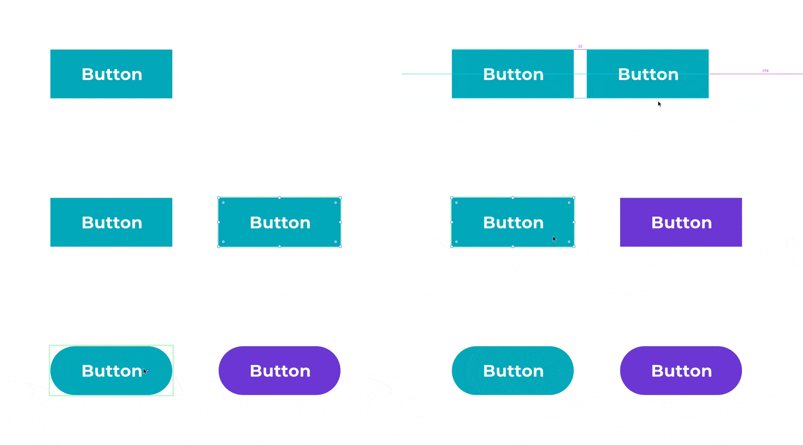
The past few months I’ve felt a big improvement in my ability to deliver quality work in a shorter amount of time using systems-based thinking. A wise person once told me the difference between a professional and an amateur is that they both can arrive at a beautiful final product, but the professional does it in a fraction of the time. I’ve really focused on leveraging systems throughout the creative process which allows me to save an enormous amount of time in the end. A good example of this is setting up components in XD which allows me to make changes in one spot and have it automatically be applied to multiple other instances.

Utilizing systems-based thinking and standardizing similar objects saves a ton of time across the life of a project. When I do this I save time not only for myself by staying within the guardrails of my design, but I also have the added benefit of knowing when I hand off a design to development that I’ve already put in a little bit of thinking as to how the experience will be built. This tiny bit of effort helps make their job easier by eliminating guesswork and unnecessary redundancies. Work smarter not harder, y’all!
What are your favorite online resources (news, blogs, tools) and why?
For those leisurely strolls through inspiration alley, I like the Muzli chrome plugin. This converts your “New Tab” screen into a dashboard of curated content. Mine is loaded with everything from visual inspiration such as noteworthy projects on Behance or Dribble, to industry news about emerging technologies that have an impact on our industry or the tools I use on a daily basis.
For dedicated research into best-in-class experiences, I love taking a spin through Awwwards. Granted, there’s a heavy bias towards form-over-function which is a big no-no when it comes to proper user experience, but I love being able to read between the lines of what makes an experience great and using that insight to drive my creative approach for client experiences.
For those times I need to learn more about a given topic, I try googling the phrase and adding Medium.com in order to dive into long-form articles that may help me form a perspective around a new topic.
What is a key element of user-centric design that you would advise others to always look out for/pay attention to?
I think a critical piece of user-centric design is maintaining a consideration of convenience for the user throughout your design. Convenience is one of those things we intuitively seek out but don’t necessarily recognize until we encounter something inconvenient. With that in mind, designers should always be on the lookout for small ways to include convenience in order to reduce friction across the experience. A great example of this is with a popup modal. Give the user multiple options of closing out the modal such as the classic ‘X’ up in the corner, a decline / no thanks button underneath your primary CTA, and last but most important — make the surrounding area around the modal be clickable so the user can “click out of” the modal.
What is some advice you would have for someone who is new to letting data drive their design process?
Check your ego at the door and accept what message the data is trying to convey! Very rarely will a designer be an exact match for the target demographic, so that means any personal opinion about what needs to happen with the design should come secondary to what the data is telling you. In fact, you should get excited about the story the data is telling you — you’re being handed a cheat code for how to approach an experience because you have statistical data backing up the decisions you need to make.

Why should people care about good design?
People should care about good design because truly good design should theoretically never be noticed. The design should be built and executed so well that the user is completely engulfed in the experience and doesn’t even notice anything outside the intention of the design. Sometimes a design can be too good — amazing — in which it pulls the user away from the actual intention of the design due to the spectacle and appreciation for the design itself. Ironically, for that reason, those “amazing design” experiences are actually not as great as good design.
What’s been your favorite part of working at an agency that focuses on customer-centric design?
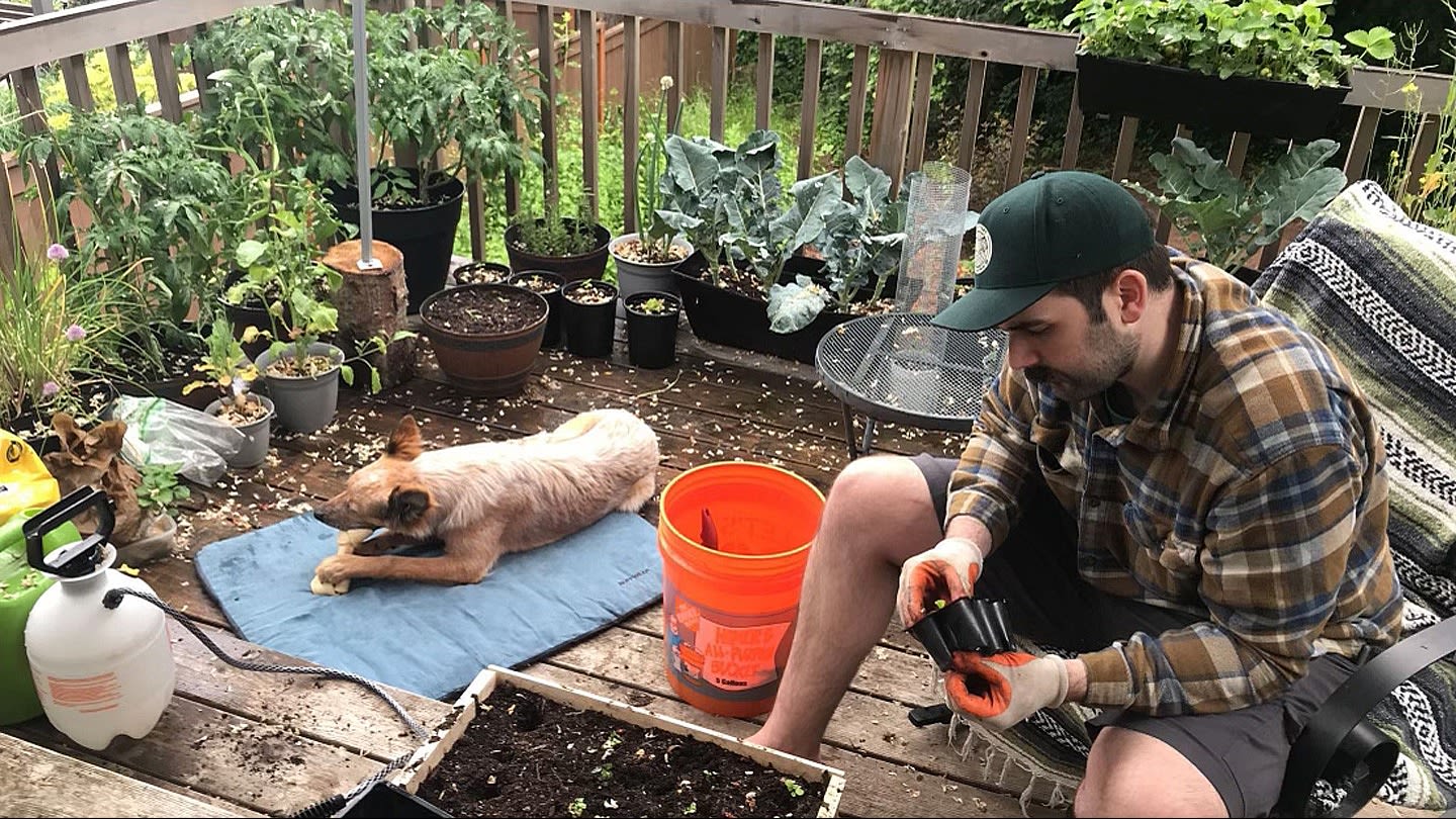
I love working with customer-centric design because as an average Joe myself, I find the work relatable and rewarding when done correctly. We’ve all encountered frustrating user experiences so the idea that I can contribute in some small way that helps people achieve their goals faster, easier, and with more enjoyment is really exciting to me — whether those goals are starting a new fitness journey, saving the Earth, or simply ordering a can of dog food.
I also just love having the support network of an amazing team of talented individuals who share common values. For several years I’ve had a cheesy professional mantra that I live by which is, “Do good work for good people”, but after joining Roboboogie I officially amended that to be, “Do good work for good people, with good people.” It doesn’t exactly roll off the tongue but dang, it feels good.


