Top 5 Things You Need to Know about GA4

On July 1st, 2023, Google will sunset Universal Analytics and replace it with Google Analytics 4 (GA4). This new platform is designed from the ground up to be fully compliant with the General Data Protection Regulation (GDPR) and is built for the future, allowing organizations to seamlessly integrate desktop, mobile, and app traffic in one centralized environment. There are numerous reasons to be excited about this shift in data collection, but digital organizations around the globe are faced with the challenge of migrating their analytics in an efficient and accurate manner. As a digital optimization consultancy, analytics is central to our mission of making the internet a better place through data-backed recommendations. Whether you’re an analytics pro or just getting started, here are our top five tips on preparing for GA4:

1. Event-based data collection, rather than session-based 

GA4 takes an entirely new approach to data collection than previous versions. Whereas in Universal Analytics (UA), events were captured and reported on within a duration of time called a “session”, GA4 processes each individual interaction as a standalone event. This allows for the seamless tracking of a user as they browse on their phone, research on their tablet, and convert on their home computer (for example).

2. New UI, new reporting 

GA4 isn’t just a new name and data structure, it also features a new and simplified user interface. You don’t need to be a professional analyst to get actionable insights right out of the box. Simply browse the pre-built reports and dive in! If you’re a seasoned vet looking for a familiar experience, you may find some of your tried-and-true reports look or behave differently, but with GA4’s Explorations you can slice and dice your data for more powerful custom reports, leveraging a gallery of robust templates or free-form analysis.

3. Events are simpler than ever

Implementing and analyzing events to understand your digital experience is easier than ever with GA4. Under Universal Analytics, events include a three-tiered structure, which relies heavily on Google Tag Manager (GTM). However, GA4 tracks unique interactions under a single event name, with necessary additional details being captured as event parameters. For example, “click_video” may be the event, with an event parameter of “Top 5 Things to Know About GA4”, which is the title of the video. You can even create events and conversions based off of either event or event parameter, allowing a page view for your confirmation page to fire a unique event to track conversion performance.

4. GA4 puts privacy first

GA4 is fully GDPR compliant and uses first-party cookies, but is also designed to leverage machine learning to work in a cookie-less future. The inclusion of machine learning-powered artificial intelligence offers deep insights and quality of life improvements to your reporting—like understanding when a user is sent off-site to complete a transaction but sent back to your site for confirmation.

5. GA4 is not retroactive 

While the mandatory switch to GA4 goes into effect on July 1st, 2023, it’s important to understand that analytics data is not retroactive. The sooner GA4 is up and running on your property, the better its machine-learning capabilities will be able to serve your business goals. Running GA4 and Universal Analytics—or GA360—will not result in any breakages, so there is no harm in running them in parallel. It’s likely GA4 will continue to see updates before July 1st with more features being released or improved. There’s no better time than now to jump in and start learning!

In Closing

With just five months until the switch to GA4, do you have your migration plan ready to go? From auditing your set-up to configuring events, we’re here to help create a custom solution for you. Don’t wait until July, connect with our team today to get started! 

The Mission for Fully-Perfect Customer Connections

Each step forward, no matter how winding the path, is a step closer to digital transformation.

Over a decade ago, Roboboogie humbly began as a specialized design boutique focused on solving complex UX challenges for our clients. As time went on, we rounded out our services to cover the full web experience with expertise across digital marketing, creative, and web development. Like our peer agencies, we had to rely heavily on institutional knowledge, best practice, industry insights, and a healthy dose of intuition.

In 2015, we layered on A/B testing thanks to a fresh partnership with our friends at Optimizely, which unlocked a new ability to run experiments in rapid fire. Shout out to our first A/B testing client, The Clymb! A/B testing opened a new and powerful way to help our clients through iterative site improvements. We could now validate our UX strategy and make swift improvements to bring about big, measurable change.

Experimentation made customizable data collection simple, creating the opportunity to let data drive design decisions. The data quality, paired with our ability to translate numbers into insights, provided a deeper path into client partnership. As we have gained experience in the field, the suite of analytics technologies we utilize has grown. We’ve harnessed an array of qualitative and quantitative analytics tools to drive new insights including Adobe Target, A/B Tasty, Google Optimize, Convert, UserTesting.com, FullStory, Crazy Egg, Hot Jar, GlassBox,  among many others. We even developed a healthy obsession with Google Analytics that led us to building a custom A/B testing algorithm within GTM.

However, our service offerings between data, design, and technology remained siloed and clients often connected with us for a single solution. We knew the value of integrating this work, which led to our transition from an agency to a consultancy. As our position within partner organizations continues to elevate, our role has increasingly been about charting the best path forward with our clients. Our teams have become intimately entwined, building off of each other’s work on the mission of digital transformation.

Unified in mission.

Optimization is no longer something we do at Roboboogie, it is how we live and breathe. It is not a product offering or deliverable. It does not live with one role, individual or department.

Everyone on our team is an optimization consultant, and every individual shares that same top-level goal. Our team is routinely asking themselves, “Does the work I’m doing help move my client toward ‘perfected brand-customer connection’? What is the most valuable thing I can do right now to advance that mission? “ 

The secret sauce of optimization is in process. It is the methodology in which you identify needs, prioritize opportunities, develop solutions, and execute plans. It’s in the deliberate weighing decisions against the mission: a lifetime customer bond. It’s a recipe we’ve been developing for over a decade.

Our optimization recipe.

  • Partner with innovative clients who are passionate about holistically driving transformation of their digital experience.
  • Develop audience personas and map customer journeys – informed by data –to understand the deep needs and desires of customers. 
  • Harness wide data sets and powerful technology to unearth gaps in the current digital experience that can be filled with design solutions. 
  • Integrate teams of experts across data, design, and technology.
  • Customize the optimization strategy for each client.
  • Let data guide the journey, but never let numbers stifle the creative process.
  • Stay nimble and responsive. Each step forward, no matter how winding the path, is a step closer to digital experience transformation.

True, authentic digital transformation takes time. It takes a continued commitment to reorient to ever-changing customers and the all-out pursuit of taking each experience one step closer to perfection. Each step provides reward with more customers, happy customers, and improved performance.

Looking ahead.

Internally, we use the playful mantra “Happy Customers Convert.” Since our beginning, we have always held the customer at the heart of everything we do because taking care of people gets the best results. Over the years as we have layered on measurement tools, we have been able to prove that to be true. When customers’ needs are met, business performance follows. It turns out, happy customers do convert.

As we officially transition Roboboogie’s focus from Website Performance Optimization to Digital Experience Transformation, we are eager for the next chapter ahead. You’ll still be able to expect that same great work and services we offer, but with a higher unified vision. There’s so much untapped potential across the digital landscape for organizations to connect their data, design, and technology efforts to create fully-perfect customer connections online. Investing in Customer Lifetime Value pays. We have witnessed it first-hand (with big business impacts) for some of our long-time client partnerships – NordicTrack, Adobe, and Wacom to name a few. 

If you are interested in partnering together to create digital environments that form undeniable connections and life-long bonds between your brand and customers, hit me up (Jed@teamroboboogie.com). I’d love to share more about how we can help you better meet your customer needs in the digital space. I can confidently say you’ll be thrilled with the business outcomes. 

Until then, just remember: Happy Customers Convert.

Jedidiah Fugle, Roboboogie Chief Operating Officer

User Inclusion Through Agnostic Personas 

There’s a good chance you and your marketing or product team have personas in hand. They are an indispensable tool for creating meaningful, personalized experiences for your customers, prospects, and users. Have you ever wondered if the personas that you have are effective? Are they accurately representing your audience segments?

Well, you aren’t alone. Re-evaluating your personas is a great exercise and we highly recommend doing so. There are many lenses through which you can perform that evaluation, and we want to share some insight on making your personas more inclusive.

What are personas?

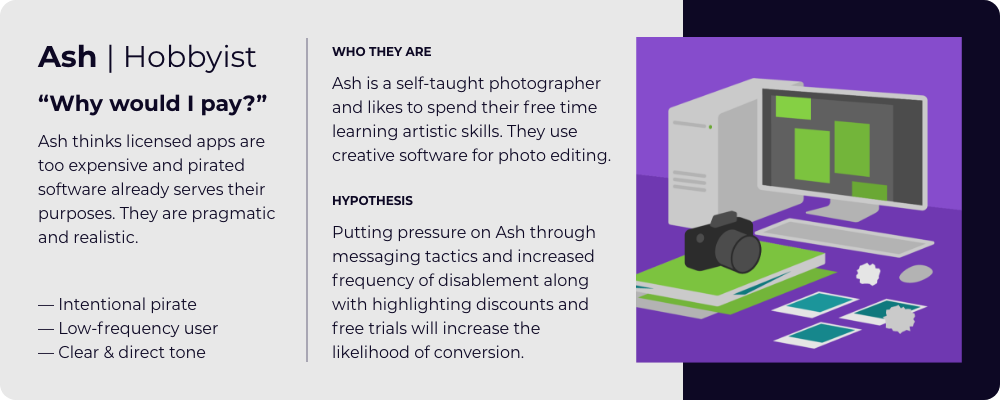
Personas are an important UX tool to aid in helping brands and organizations speak to sections of their audience. They can be presented as an infographic or visualization that describes a specific user type which has defined characteristics that make the segment unique from another segment. Personas highlight opportunities for personalized communication and experiences that resonate with the motivations, behaviors, and needs of subsets of the total audience that a brand might be looking to connect with. By creating personalized experiences for each persona, there is a higher likelihood that they will purchase, develop brand affinity, and have a positive experience or develop a positive sentiment toward your company.

The Persona Misconception: “Person” vs. “PersonA”.

When creating a persona, you have to identify common characteristics across many users to start creating a target to aim for. However, this approach is often taken a step further than it needs to be, and suddenly we’re looking at a character profile of a person instead of a group of people. Companies will put in a lot of time and effort into gathering data for a set of personas, and they want to put all of that data to use (rightly so), but this often ends in a very specific scenario for a very specific person, which in the end defeats the purpose of a persona. Here is a short example:

“Jamie Richardson is a 25 year old female, and she lives in Shaker Heights, Ohio. She has a 4 year degree from University of Miami and a yearly income of $45,000. She is single, has no kids, and makes all of the purchasing decisions for her 1-person household.”

There is not a very high likelihood that an entire user segment aligns with all of these characteristics, but it’s very common to see this kind of hyper-specific demographic data in personas today. While there are benefits in certain situations to using this detailed approach, more often than not, it creates a persona that is not representative of the entire audience segment. This approach is, in our experience, a byproduct of the templatized way personas have been taught and inherited into the UX practice.

This process of turning personas into a person often begins with demographics, the first defining features of a persona, and the desire to create a tangible representation of the audience group. So marketers start to attach ages, marital statuses, family make-up, and genders to the persona that are not providing any intrinsic value to the persona, but rather excluding users unnecessarily. You might look critically at your existing personas and ask questions like: Why is this persona 52 years old? Why do they have 2 children? Is it relevant that they attended this specific school? Looking critically through this lens is a great way to identify if there is superfluous information added to personas to make them “look like a persona” when in reality these key demographics give nothing to the overall persona.

The Persona Golden Rule(s)

We’d love to share with you a few tips that we use when establishing our personas. As an exercise, you can apply these recommendations to your existing personas and see what kind of difference it makes.

  1. If it does not add value, make it agnostic.
  • Ages become age ranges
    • If a defined age is really important to your segment, then by all means, go with a specific age for your persona. If not, go with an age range – it’s more inclusive of the segment you are speaking to.
  • Genders become neutral. Use they/them pronouns.
    • This is a great opportunity to expand the way your internal team thinks about the members of an audience segment. You may have chosen a gendered name or user story to convey the needs or motivations of your persona, but that may actually be limiting your effectiveness. If there isn’t a strong case for the persona to be gendered, try shifting to gender-neutral pronouns.
  • Names are changed to archetypes (ex. John turns into The Realist)
    • Similar to shifting from gendered to gender-neutral pronouns, the shift to archetypes from names can better represent your persona. Names can carry a lot of unintended information about geolocation, gender, ethnicity, or class that could unintentionally bias how you approach and message to that audience segment. Archetypes of behavior or motivation keep the focus on user needs, motivations, and behaviors. 
  • Locations are removed, or generalized to larger regions
    • Does your audience segment live in a particular country, region, city, or town? If not, we’d recommend that you not include that type of location information in your persona – it may not be representative of the entire persona group and/or it may not be relevant to how they make their decisions.

2. If it DOES add value, make sure that is documented somewhere in the persona.

Of course, there are times when you DO want to include all of the things we just called out – as long as they are factors that uniquely speak to all the members of the audience segment the persona represents. Here are a few examples.

  • This persona is 50 because that is the average age of menopause.
  • This persona is male because the majority of our audience is male.
  • This persona is named John because that is a common American name representative of the audience segment.
  • This persona is based in San Francisco because this user type is often found in silicon valley.

When evaluating the Do’s and Don’ts, you can apply a value test to the persona.  If you were to send this persona in an email to a stakeholder who has no other context besides what is stated on the persona, will all of the information presented make sense? If not, revise. 

Keep in mind that when an unnecessary piece of information is added to a persona, such as gender, you are automatically removing every other gender from that user group. Only add information if it is relevant and valuable.

Not sure if your personas are meeting your needs? Let’s chat! Our team of experts can help evaluate, revamp, or create net-new personas for your organization.

In the race between Trump and Biden, who wins for most user-friendly mobile campaign donation site?

Biden and Trump Presidential Election

The presidential election is less than a month away and as the candidates make their final pitches to the American people, they both need two things — votes and, of course, money, money, money.

Both candidates’ campaign websites are out in the wild ready to inform, persuade, solicit your donations and, yup…sell ya some swag. U! S! A!

While we recognize most people’s minds are already made up, blue or red, we couldn’t help but wonder just how influential these websites might be to someone who is on the fence and considering making a donation. We challenged our team to put our biases aside, for just a second, and take an objective look at each site’s effectiveness (side note, this proved to be a really difficult task).

We asked the question, what if, say, you were knocked on the head with a large pumpkin while decorating your house for Halloween. You woke to selective political amnesia and a sudden realization you had to donate $10,000 to either Joe Biden or Donald Trump or be forced to eat only candy corn for the rest of the year. Armed with only a smartphone, 10 minutes, and a link to each of their websites, who would get your money?

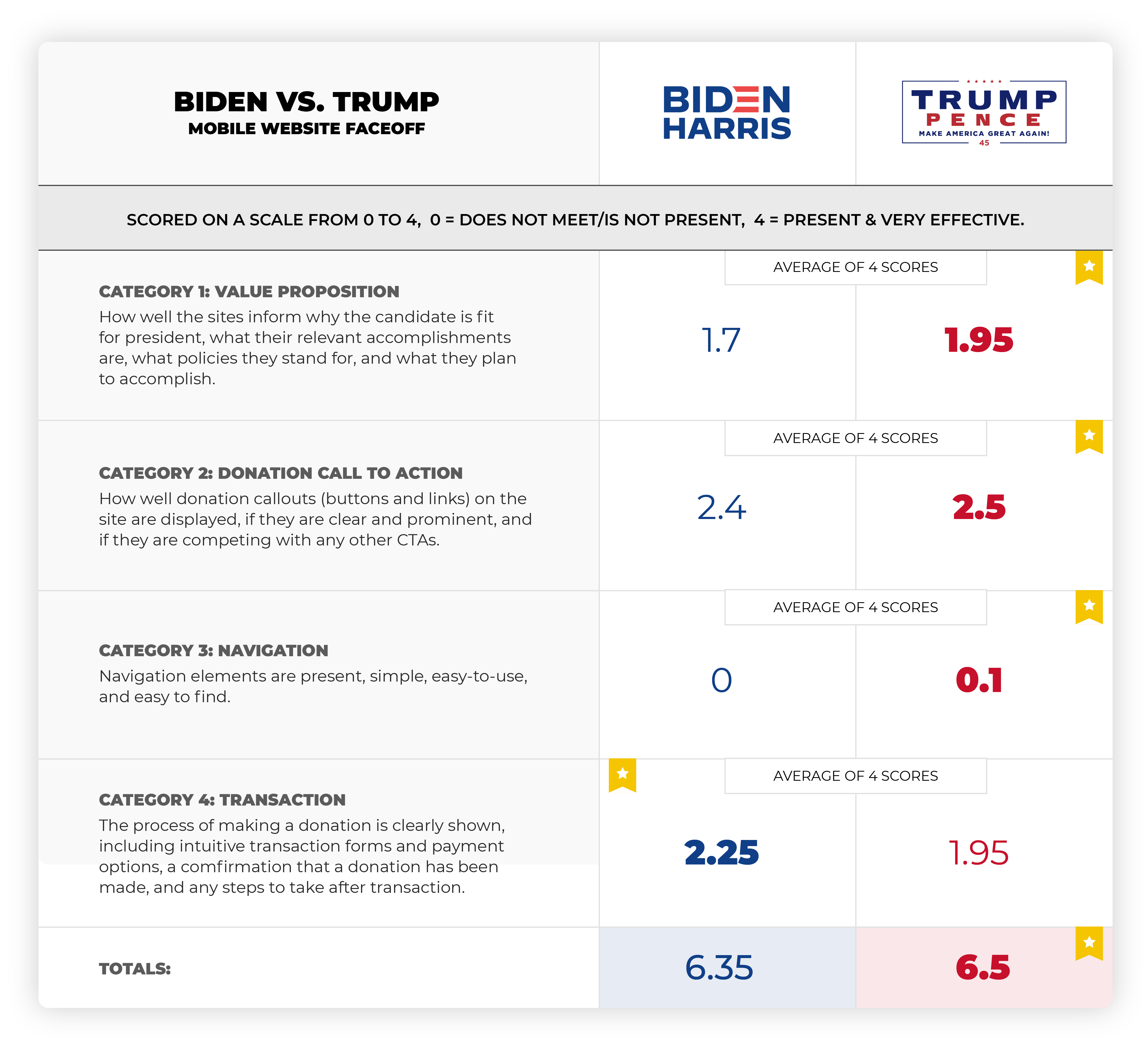
The winner, by a thin blonde hair, is the sitting president, Donald Trump.

But just like the debate fly on Mike Pence’s head, it was very close.

So, how did we get these results?

Five of our top UX design and digital experience experts evaluated each website’s mobile experience based on four experience categories: value proposition, donation call to action, navigation, and transaction. We broke these down into performance criteria and for each one we gave it a value from zero for “does not meet or is not present” to three for “is present and very effective.”

Five experts ran independent audits to score each site in these categories. To broaden our sample set, we then totaled and averaged our scores.

Want to see the whole heuristic audit? Scroll to the bottom for the full details.

Here are some result highlights: 

First, the bad news for both candidates — navigating through their sites on a mobile device is not easy. Both sites lack a clear value proposition, have too many competing calls to action, and navigation options and search is difficult if not impossible to find. So, while Trump is technically the winner here, both mobile websites have room for significant improvement.

For both sites, it appears that mobile design is not a priority. In 2020, that’s a huge oversight. From our perspective, this is a huge lost opportunity to reach a broader and younger audience ready and willing to engage.

Trump pulled ahead in the value proposition category. His website more clearly laid out his accomplishments and policies, though it lagged behind Biden’s in future planning.

When it came to the call to action to donate, Biden actually out-maneuvered Trump. Biden’s donation amounts started smaller — $15 to Trump’s $35 — and, according to one evaluator, were almost too prominent throughout the mobile experience.

But Trump’s calls to action were more consistent and a little less overwhelming. Unless you actually donated, at which point, the evaluator said, the CTAs became “absolutely unbearable in their persistence.”  

As far as that transaction itself, after you donated that $10,000 and moved on to a blissful, candy corn free 2020, neither was great. On Trump’s site, you have to sift through 14 screens before you reach a “thanks for donating” page. 

Trump’s pop-up ads felt like fake news, and Biden’s site was buggy in places. Neither full experience was very presidential from our perspective.

To summarize: 

First of all, we proved it’s really hard to put down biases to conduct an audit like this. Particularly when evaluating value propositions. We tried to stay objective and quantify our results as much as possible. While this is a small (statistically insignificant sample set) we still believe it provides valuable insights both camps could use to improve their sites and increase donations. 

Trump’s website is a clear winner in the usability category. But, it was a close (and certain to be a controversial race). 

For a website show-down in 2020 when user experience, navigation, and access to information is key, especially on mobile, we were surprised that both candidates’ sites were needing a lot of optimization. It seems shortsighted that both were primarily built for desktop. 

At this point, it’s probably too late for the candidates’ sites to be optimized. But hopefully not for you! Interested in seeing you how your website holds up to this kind of scrutiny? Contact Roboboogie at hello@teamroboboogie.com.

Regardless of who you are campaigning for, please get out and vote!

Assessment Disclaimers:

For this assessment, we decided to focus on the mobile experience but briefly viewed the desktop experience for comparison. Our assumption is that more than 50% of traffic to these sites is on small mobile devices but this has not been verified.

Also, please don’t get all fired up for a debate with us, we only have a small sample set here and we’re not intending to take a political stance. Our goal is simply to bring some levity to the election and demonstrate how a heuristic evaluation can be a helpful tool in identifying optimization opportunities and evaluating competitor experiences. 

Here’s our process:

To scorecard each website, we first needed to develop our evaluation criteria and assign a performance scale and value to each based on the following metrics

0 = does not meet/is not present 
1 = is present but not effective 
2 = is present and effective
3 = is present and very effective

THE EVALUATION: 

Category 1. 

Value Proposition (must be present within 1 click of home page)

These websites are largely intended to be informational. An online bio and portfolio of each candidate and their campaign platform.

The website clearly and concisely stated position on the following criteria:

  • Why/how they are fit to be president
  • Relevant accomplishments
  • What policies they stand for
  • Why these policies are important
  • What they plan to accomplish

Category 2. 

Donation call to action

For CTA’s we are going to focus on donations. We can assume that in addition to the informational side we evaluated above that donation solicitation is a primary site performance metric. 

  • Donation prompts are present and clear 
  • Donate CTA (button(s) is present
  • Donate CTA (button(s) is prominent 
  • Other CTAs are not competing with donations

Category 3.

Mobile Navigation:

  • Primary navigation options are 5 or less
  • Secondary navigation is clear and accessible
  • Contextual navigation is provided on the home screen to support primary content areas
  • Search is available and appropriately located

Category 4.

Transaction:

  • Steps to donate are clearly stated
  • Transaction forms and payment options are present and clear 
  • Error notice and recovery options are present and clear 
  • Confirmation of donation transaction completion is present and clear 
  • Post donation actions are present and clear