Go Back
There’s no denying the importance of innovation in digital product development. The digital marketing ecosystem is no exception. The apps, websites, and related technologies and services it’s composed of are always changing to meet constantly evolving consumer needs and behavioral changes.
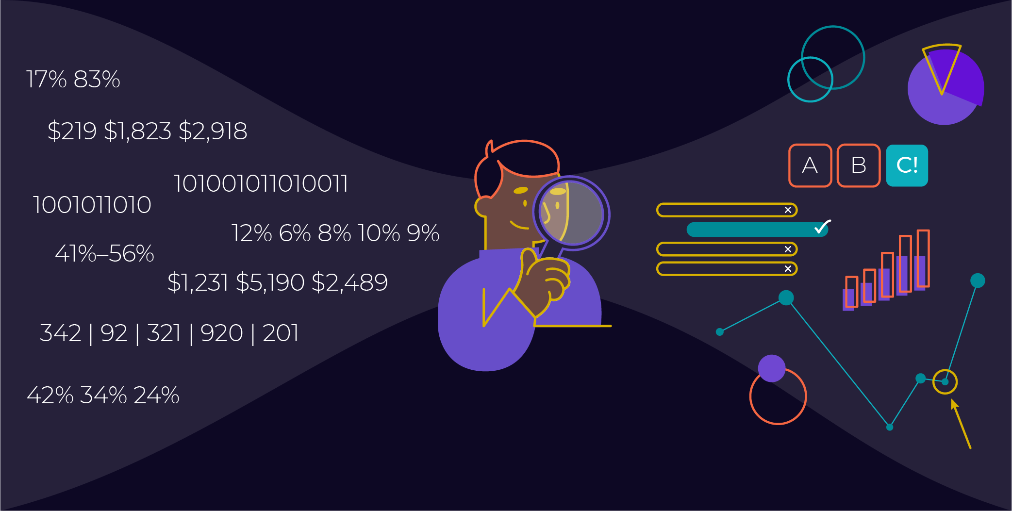
In the world of analytics, more effective data visualizations are the reigning champion of innovation needs – visualizations that help us better sift through and understand the avalanche of data in front of us. The FullStory platform is a data processing powerhouse that champions better customer experiences. Their latest data visualization feature ‘Dashboards’ puts FullStory squarely in the ring with other highly effective data visualizations we love.
We sat down with our Behavioral Analyst, Tyler Hudson, and Sr. Account Executive, Matt Bullock to chat about FullStory’s latest data visualization feature, Dashboards. As key strategists on the RoboDX team, they use the FullStory platform every day to bring valuable insights and optimization opportunities to our clients.


Let’s start with the big picture. Why is data visualization important for a behavioral analytics platform like FullStory?
Tyler: At its core, an effective behavioral analytics visualization allows anyone to understand what’s going on with the customer experience. It’s a distillation of a really complex data set into something approachable and easy to understand – regardless of how familiar you are with interpreting analytics reports. It shows, at a glance, what is, and isn’t working on a website – that’s extremely valuable to my role in communicating actionable insights to our clients. When everyone is comfortable with what’s being presented and recommended, they can utilize that information to make significant improvements – that’s so much more effective than navigating an Excel spreadsheet full of numbers or a bunch of data points in Google Analytics. It’s a powerful communication tool for anyone in the company, especially key stakeholders who might be more business-minded and easily overwhelmed by raw data.
Matt: The benefit of effective data visualizations is that the data points you’re viewing are rendered into an understandable story that easily translates to actions. Decision-makers in an organization often are not the people mining through data or performing an analysis. Their focus is on reviewing key metrics to make smart business decisions. When they have clear data visualizations in front of them, they can see trends and outcomes without being an analyst. That’s powerful stuff that gets results.
Tyler: Definitely. The new analytics platforms like FullStory are empowering marketers to improve digital customer experiences at a much quicker rate. Essentially, customers are helping themselves simply by interacting with a site and allowing brands to see what’s working and what isn’t. Data visualization is at the epicenter of understanding that information–it’s pretty cool from both a consumer and website performance perspective.
So going a bit deeper on FullStory, the Dashboards feature is new. What do you like best about it, and why do you think that it’s such a key innovation point?
Matt: FullStory has made data visualization a key focus of their platform with a number of other features outside of Dashboards. How they visualize elements when evaluating session replay, drop off rates, conversion funnels–those are all data visualizations that make analysis easier and more intuitive. It’s a natural progression to move into Dashboards, so you can combine data into a shareable format for data presentation.
For organizations big and small, the migration to a single platform view, where you can manage data and view those visualizations, lowers the barrier to entry, strengthening adoption and ROI for the platform. FullStory has that comprehensive view into customer behavioral data and now the visual analysis, potentially removing the need for several pieces of software.
Tyler: FullStory’s whole offering centers around making analytics accessible. They’ve already automated a lot of the platform with custom dashboards on the homepage such as bar charts, line graphs, and heat maps, which are really strong visualization tools to show engagement.
With Dashboards, you don’t have to rely on an analyst to export all that data or deal with the additional step of creating visualizations in another platform like Tableau. You can easily set these up with a few clicks, eliminating the need to wade through a sea of data.
If you had to pick one thing you love best about Dashboards, what would it be?
Tyler: For me, it’s how easy the feature is to use. I’ve worked with a lot of analytics platforms and data visualization tools and there’s typically a bit of a steep learning curve. With FullStory, if you’re already comfortable navigating the platform, you’ll be able to jump in and build these visualizations almost immediately. The way they’ve structured it is so user-friendly and presents the information you need in a very digestible way, which really resonates with me. There are plans to evolve and grow this feature, but I feel like the initial launch is a really solid foundation. Right now, it’s exactly what you need to get started. I’m excited to see how they customize it further.
Matt: Yeah, I agree, it feels like another native, intuitive feature of FullStory. You can quickly create Dashboards based on specific goals or KPIs and build out Dashboard cards for different teams. There are card types for single metric values and for user flow funnels, and they both use the same layout as accessing segments in the platform. That consistency makes it really easy and intuitive to get started and include visualizations in your analysis workflow.
What would be the first card that you would set up on a Dashboard for an e-commerce site?
Matt: I would set up high-level metric cards to track day-to-day, big picture operations, like conversion rate, average order value, users, total sales–all of those things that I want to see at a very important high level in my FullStory Dashboard. But then I’d set up additional, more funnel-specific cards in the Dashboard, like my Conversions checkout flow. And then if you want to do additional conversions analysis, you can go right from the Dashboard to that element in Conversions.
Tyler: I’d start navigating to Dashboards before diving into session replays, just to get that understanding of what’s going on. Whether that be a drop off rate in the checkout flow or the general site performance on paid traffic. For example, if that’s going down, using that to inform what you’re searching for in a larger application. If you’re seeing a big drop off on your payment page, you go watch sessions from the payment page. Use it more as a jumping-off place early on and then starting to hone in on more specifics down the road.
Those are some great e-commerce examples. What about websites designed for lead-generation?
Tyler: Oh yeah. It’s perfect for that. There’s a lot of information gathering that happens before someone commits to signing up to engage in a sales conversation. Particularly for larger purchases. It’s really valuable to be able to see their path leading up to the conversion/sign-up and gain a better understanding of what content is resonating, and where they’re spending the most time. But those behavioral metrics like time on page, session duration, that help paint a picture of what’s working and what is not, can be a bit more difficult to evaluate. So, visualizations combined with session replay is a really powerful combo for lead-gen.
Matt: One thing that is critical to capturing users at the top of the funnel is identifying those positive signals on your website that indicate somebody is interested in purchasing your product or your service. As you’re making improvements, the ability to identify and iterate on those elements that make a difference, and seeing the effects of your enhancements in your Dashboard, can be really powerful and empowering.
Dashboards is useful in other ways as well. Take for example A/B testing. Dashboards is perfect for monitoring test performance. That’s really important for a lot of experiments, particularly when sales and conversions are at stake.
Tyler: Yeah, definitely. One of the cool features within Dashboards is the ability to look at performance from a macro level and then really zoom into the micro-level details. Whether you’re A/B testing an element, changing the hierarchy of a page, or changing an entire page design–it can be as granular as you want. You’re able to look at a macro level and say, “I want to understand more of the why behind this”, then zoom in on page performance. That’s all possible because every interaction is tracked in FullStory and available in Dashboards.
Here’s a scenario to help illustrate this. Say there are five CTAs on a page, and you want to run an A/B test to reorder them and test engagement. Dashboards makes it easy to compare the performance of your baseline to the new design. If you have your A/B test set up correctly, you just build your segment for the test, and then you can automatically customize that and leverage existing Dashboards to have a visual representation of the test performance. It’s great for not only monitoring results but also communicating performance!
Thanks, Tyler & Matt!
Our partnership with FullStory adds a top-notch experimentation platform into our quiver of technologies we can use on our quest to optimize digital experiences for our clients. Dashboards will become available in August, and stakeholders and analysts alike will find it meets their visualization needs and beyond. Stay tuned for more updates from the RoboDX crew in the months to come!
Looking for some more interview action? Check out our conversation with Harrison White, Partner Manager at FullStory.


