Go Back
A Team Perspective on Creating a More Genuine Brand & Website
Well, looks like the cat’s out of the bag. And by cat, we mean the brand spanking new Roboboogie website: Refreshed, revamped, and ready to rock in 2020 and beyond. For us, this brand and website redesign was a large dose of our own medicine. We leveraged our existing website data, we interviewed stakeholders, we applied our user-centric approach, and we let our creativity and individuality shine through a lengthy, multi-disciplinary process. The result is a much-needed refresh for our web presence that we couldn’t be more proud of.
We’d like to take this opportunity to give you an inside look at our process from the perspectives of key individuals whose hard work, dedication, and passion made our redesign possible. Buckle up! It’s been a wild ride.
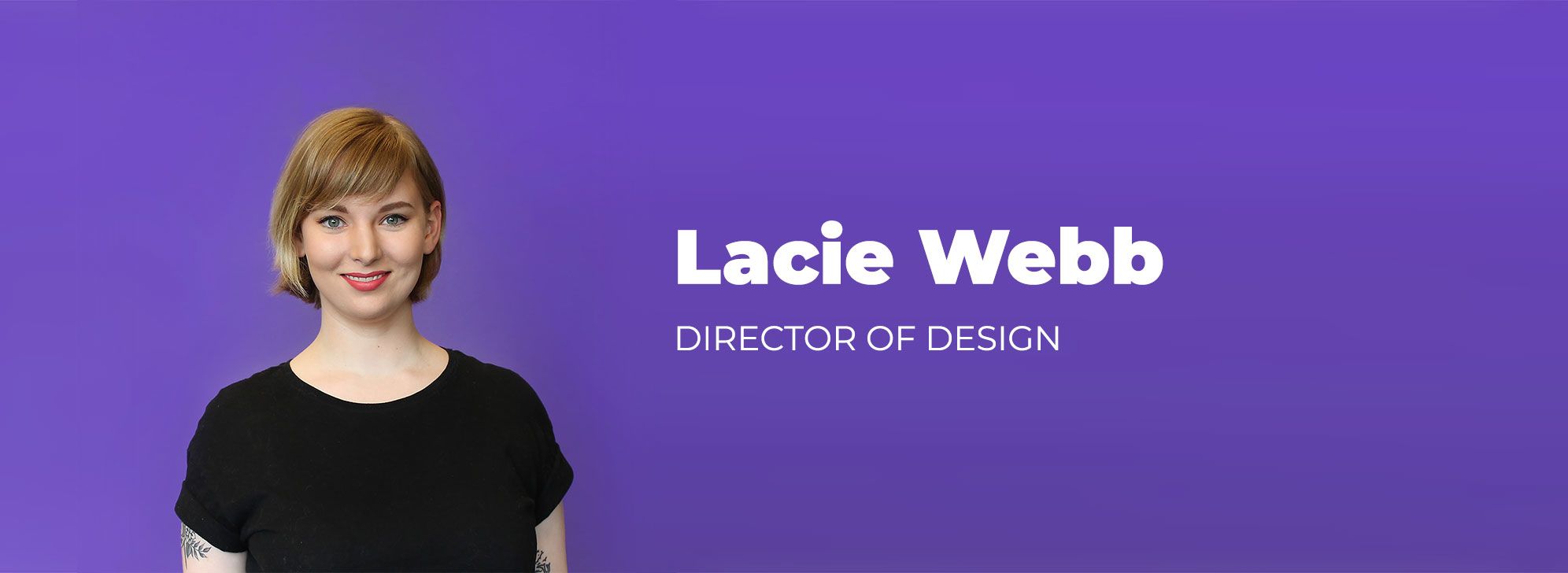
Design Strategy Perspective

What are the top 5 things you are most proud of, or you find most innovative about the new Roboboogie website?
The main reason I’m excited and proud of our new Roboboogie brand and website is the fact that it’s a much stronger, more genuine expression of the fantastic, smart, funny individual people who make Roboboogie happen.
Our new site is SO much more robust and informative. I really feel like we’re living up to our role as consultants and thought leaders in the space. We really want to give back to our community in the form of process explanations, honest descriptions of wins, and open dialog about our own growth areas through transparent case studies and blog content.
Through this process, we’ve been able to craft content that speaks more directly to our target audience. Our creative process always keeps the needs of the end-user front and center. But, for an agency site redesign like ours, we’re speaking to a diverse group that includes marketers, ecommerce managers, prospective talent, and everyone in between. I think our new site does a great job of speaking to the unique needs of all these groups.
Building this new site forced us to refine our brand personality to that sweet spot where we live. A place where we confidently guide the client, while at the same time remaining genuine, humble, and inclusive.
It was important to me that we create a site that looks and feels the way we want, but that it’s also a site for the entire team that inspires new ideas, creative thinking, and engagement. I believe this project was an excellent way to let everyone who worked on it have a chance to stretch their legs and push the boundaries of their own limits. From custom illustration to wading into the waters of copywriting, I think each person here could tell you how they’ve grown as part of this project.
What were the 3 biggest challenges to creating the new site?
Refining a brand while redesigning an entire website is pretty much like building a car while it’s in motion. At times it felt like I was Sandra Bullock from the movie Speed.
The sheer amount of THINGS needed to develop a new brand and create a new website has been overwhelming at times. Having a lot of creative freedom and an amazingly talented team allowed us to achieve some big accomplishments including all-new case studies, intuitive development animations, and a custom photoshoot. The flip side to all that freedom and a self-imposed deadline was, of course, MANAGING SCOPE!
Additionally, a year is a long time to work on the same project with so many contributors. We faced a number of challenges, including setting and hitting deadlines, finding time to make progress while balancing client work, and maintaining consistency between hand-offs.
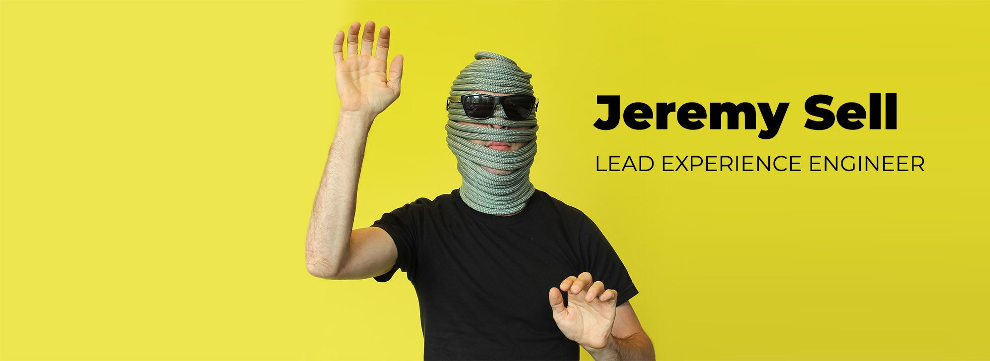
Development Perspective:

What are the top 5 things you are most proud of, or you find most innovative about the new Roboboogie website?
The ultimate, number one part of our new website build I am most proud of is that every single person in the office has left their creative stamp on it in some way and done so in a fantastic manner. It really has been an all-hands-on-deck affair.
The whole ecosystem of our brand has changed as a result of this process; from our website and emails, to the way we are presenting ourselves in meetings with our presentation decks. It’s the result of a lot of work from every team member and each part feels like quintessential Roboboogie.
For our new site, we moved all of our media assets off of our servers and onto Cloudinary’s. Media usually accounts for the number one resource draw on page load. Cloudinary offers ways to serve up the best media type automatically, at the best resolution, creating media assets that look great and load quickly.
The development team has been able to use a lot of animations to suggest/hint at interactions. We have a flowing wave in the mobile nav, a bunch of pulsing dots that are interactive, and the whole site loads upon scroll to feel like it is responding to you. There may be a couple of easter eggs, too 😉
Within the development process, we got the opportunity to build in a super navigation for the services section of our site. We wanted the super nav to slide down in one smooth motion, while also changing the background colors and font colors to the main nav while it is sliding down from the top of the page. Because these are really two separate pieces, we had to use linear motion and transition delays to make them line up perfectly. We are pretty happy with the outcome. Go ahead and try it out on desktop (the mobile experience is a whole different experience).
What were the 3 biggest challenges to creating the new site?
The biggest challenge is also the thing I’m most proud of: Every single person on the team was able to put their creative stamp on the site. In development, we wanted to make each of these parts shine. Sometimes that meant learning new technologies, and other times it meant understanding old technologies in a depth we never have.
It’s actually a pretty massive site. The design file (Adobe XD) has an option to create links for all the buttons, and maps out where each link goes. The master file, which maps every page, looks like a subway map of New York. Keeping the pages aligned and linked properly was a project in itself.
It’s our baby, so everyone has strong feelings about everything. This led to a lot of revisions and refinements and revisions to revisions, but I wouldn’t have it any other way. We want our site to illustrate our playfulness, while also showcasing the intent/care we take in all of our work.
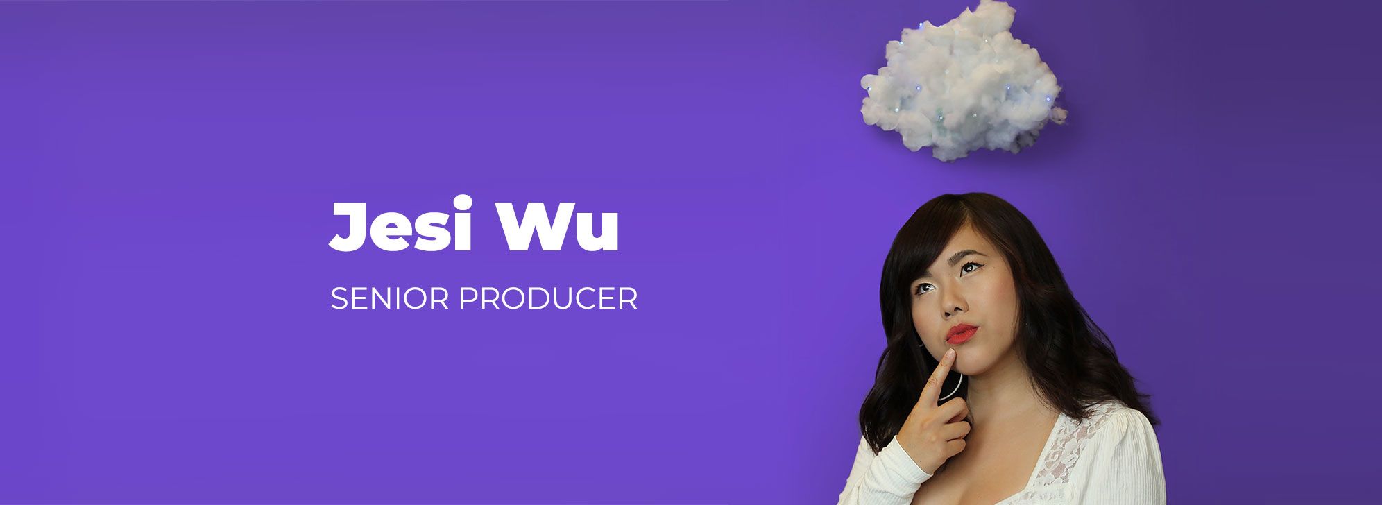
Producer Perspective:

What are the top 5 things you are most proud of, or you find most innovative about the new Roboboogie website?
I’m most excited because the new brand and website finally speaks to how I personally view and feel about Roboboogie . We’re fun, creative, smart and passionate.
We rolled out an About Page that includes team details about each individual on the team, humanizing Roboboogie as a company and showcasing our individual personalities and interests.
A/B testing and optimization can be dense topics and I feel like we’ve nailed a digestible way to convey the bigger picture and explain proven wins that companies can expect from an investment in their optimization program.
It’s been all hands on deck – the full Roboboogie team has had a hand (pun-intended) in this project.
We have very creative designers on the team who love illustration. The new Roboboogie website includes a lot of custom illustrations, which are now part of our brand. It makes me the happiest.
What were the 3 biggest challenges to creating the new site?
The biggest challenge was balancing client work (which is always top priority) while working on the new website. We had to utilize down-time hours to complete tasks and move things forward.
With the full team contributing to the website redesign, resourcing was a challenge. Team members work on various projects with different deadlines and resourcing needs.
Another big challenge is taking the advice that we give our clients. Sometimes it’s hard to practice what you preach. We had to constantly remember that we’re our own client and we need to hold ourselves accountable.
Check it out!
We hope you agree the new Roboboogie brand is a true reflection of the team and the work we do. We’re proud of what we created working together and that feels pretty darn good.
So head on over to our new website and check out our new vibe. We hope you dig it.


