Go Back
Most marketers understand the importance of excellent digital experience design. But unfortunately, situations frequently arise where designers must choose between nailing important details and meeting speed to market demands. While cutting corners may satisfy short term goals, neglecting design details can have a lasting impact on customer lifetime value.
A quick definition of customer lifetime value, or “CLV”, for those who need it. CLV is simply the value of a customer to your business across the entire relationship, not just the value of a purchase. Being mindful of CLV is important because it is more resource-intensive to gain new customers than deepening relationships with your current customer base.
Here are some areas of design that are often overlooked, and the impact they can have on customer lifetime value.
Visual cues are great ways to improve site usability.
When creating well-designed digital experiences, often brevity and minimizing distraction is best practice. However, you shouldn’t assume that the objective and calls to action are immediately clear. Visual cues and micro-interactions like progress bars, add-to-cart animations, and thoughtful hover states are often overlooked tools in the UX and visual design toolkit that make for a thoughtfully designed experience that directs users.
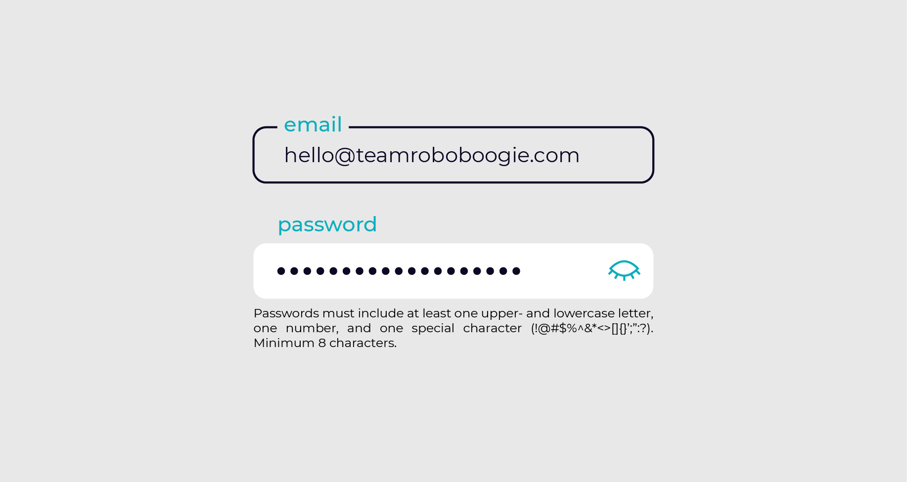
Micro-interactions and visual cues help guide users to the right path by guiding their next action and helping them better understand nuanced interactions. Among other conversion points, this helps lead some users to a purchase and decreases bounce rates for users who might otherwise wind up in the wrong place. For example, take password fields. An acceptable design may include just the form field with no password requirements listed until after a user has already attempted to submit. Visual cues like password acceptance (a checkmark) or a progress bar that indicates the strength or weakness of a password as it is entered helps create a frictionless experience.

Image choice can impact engagement.
It’s true. An image is worth 1000 words. But, the right image might also be worth $1,000. Image selections should be carefully considered. They are a primary way customers verify products are indeed what they are looking for.
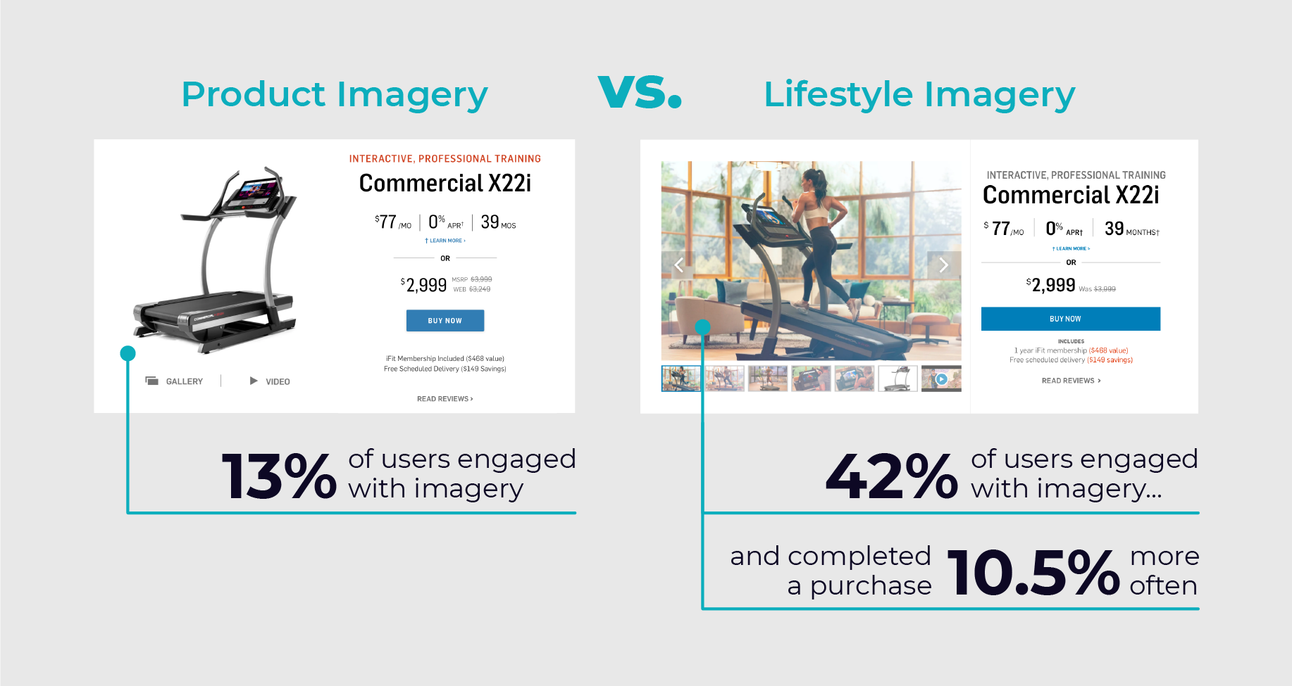
Unfortunately, image choice is often limited to stock photography, or a dated or incomplete image library. Regardless, it is important to give careful consideration to any image you use. They are powerful tools to excite and guide customers. Specific audience segment needs and preferences should also be considered. We often see users react differently to product-focused imagery than more lifestyle-focused photography. Doing more investigation into your customer’s needs, developing a narrative for your product, and A/B testing can be the keys to find the right mix of images. During one of our tests, a large home fitness equipment brand saw a 29% increase in engagement transitioning from product to lifestyle photography. Our hypothesis was that users wanted to see more of the experience of using and owning equipment in their home and that by leading with lifestyle photography, users would engage with product pages more. We were right! They were 10.5% more likely to complete a purchase.

Visuals and infographics help people consume content.
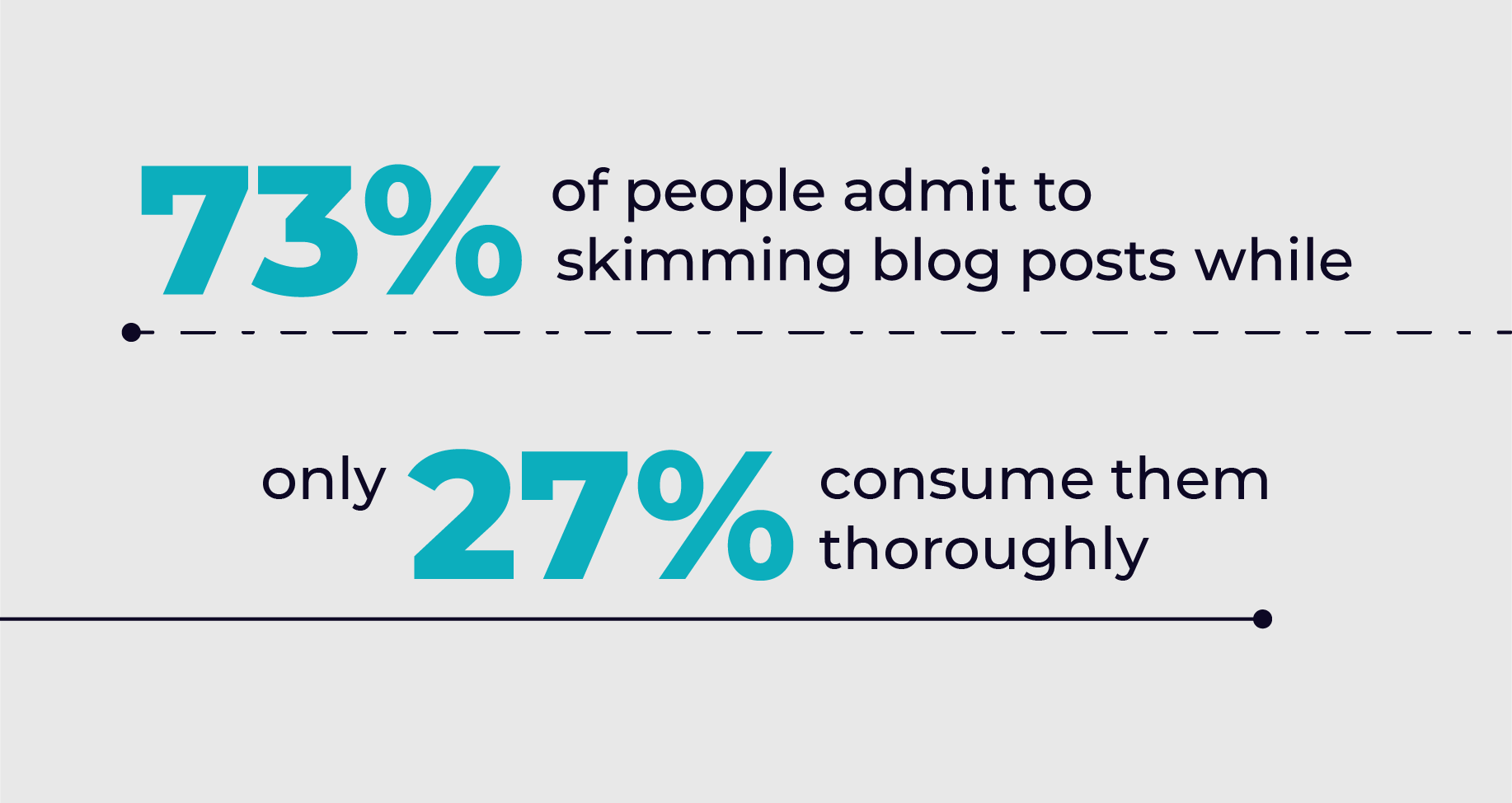
As online attention spans continue to dwindle, it’s more apparent than ever that the first 5 seconds on a website are the most important. If your content is lengthy, dry, and/or dull, chances are users will bounce from the page. Or in the best-case scenario, skim the page too quickly, missing critical content. In a 2017 study, HubSpot revealed that 73% of people admit to skimming blog posts while 27% consume them thoroughly. (Source: HubSpot)
By translating critical content into branded visual graphics, animated gifs, infographics, and visual flows, users can quickly see what information is the most important and more effectively retain actionable information longer. Investing more design hours and scope to create a well-rounded visual language for communicating content will likely result in a positive impact on conversions.

Pixel-perfect development lends credibility to your digital experience.
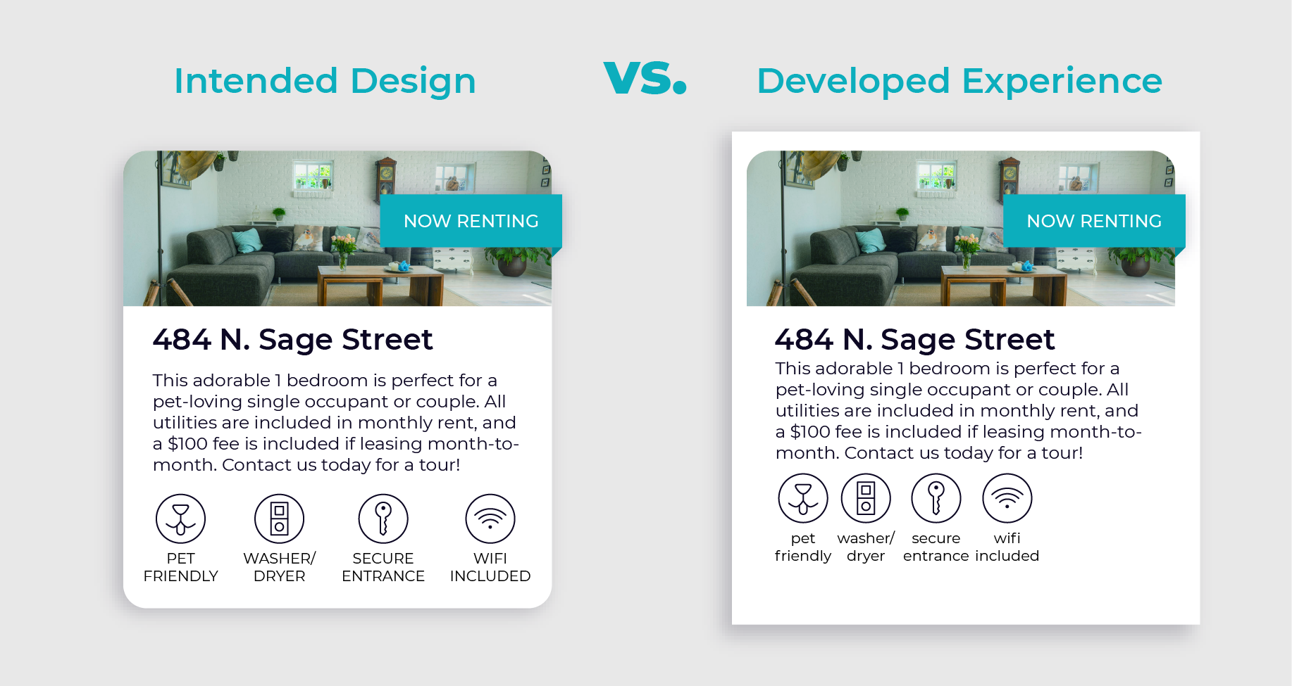
It’s important that every customer touchpoint and channel is a cohesive part of your brand ecosystem. This is even more critical with stand-alone experiences that aren’t anchored by a strong brand presence, such as email campaigns and landing pages. It’s important to take the time needed to ensure your intended design is upheld in development.
Designers know that a brand experience isn’t limited to a logo being visible and the right colors being used. The specifics of layout, flow, typographical hierarchy, and nomenclature also matter greatly. When developed without attention to pixel-perfect detail, it can break the credibility of an experience. While close designer and developer collaboration might mean adding more meetings to a timeline, it’s critical to ensuring that all your hard work in design to drive CLV is not lost.

Refining the design of your brand’s experience to reflect the needs of your audience takes time, dedication, and resources, but doing so will help turn your one-off visitors into customer relationships. Everyone appreciates knowing someone is creating an experience just for them and will be more likely to return again and again.
Know your user’s experience could use some attention, but lost on where to start? We have guided programs and proven results to get your customers coming back for more. But don’t just take our word for it–see for yourself.


